silverwind
3ae997614a
Enhance stylelint rule config, remove dead CSS ( #24472 )
...
Make this stylelint rule match on more properties.
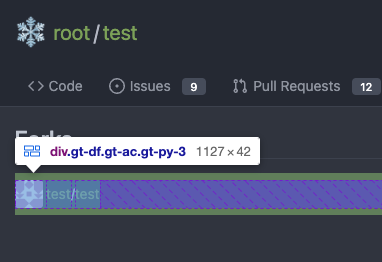
The dead CSS relates to the navbar, which currently has classes:
```
ui top secondary stackable main menu following bar light
```
Which means `.following.bar .top.menu` can never match, so remove this
dead CSS as well as inactive `z-index` and `left` on it.
Commits table striping becomes more visible on dark theme, but I don't
think it's worth introducing a new color until
https://github.com/go-gitea/gitea/pull/24423 is ready, which would have
to remove it again:
<img width="668" alt="Screenshot 2023-05-01 at 18 41 49"
src="https://user-images.githubusercontent.com/115237/235489873-6b272899-1d78-443a-872c-ee7731c269f9.png ">
<img width="680" alt="Screenshot 2023-05-01 at 18 41 41"
src="https://user-images.githubusercontent.com/115237/235489878-1b9468af-c74f-48a6-a469-9eba57cfcb4d.png ">
2023-05-02 23:15:52 -04:00
wxiaoguang
3e7101dd64
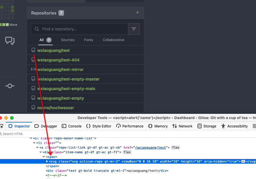
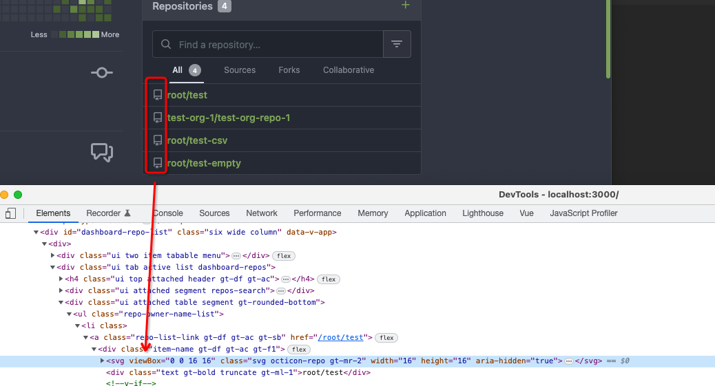
Improve "new-menu" ( #24465 )
...
I am not sure what "new-menu" means, but I think we need to fix these
problems:

1. it shouldn't have "stackable", which makes the items stacked when
width is small. the `new-menu` already has `overflow: auto`
2. `justify-content: center` doesn't work with `overflow: auto` (for
small width), so use `margin: auto`
*
https://bhch.github.io/posts/2021/04/centring-flex-items-and-allowing-overflow-scroll/
3. `runner-new-menu` is dead code (copying & pasting ?)
2023-05-01 12:08:37 -04:00
silverwind
5adf32b48e
Remove fomantic breadcrumb module ( #24463 )
...
### File path before/after
<img width="522" alt="Screenshot 2023-05-01 at 13 23 33"
src="https://user-images.githubusercontent.com/115237/235445636-57776038-c98e-4cab-8abe-045138a76958.png ">
<img width="522" alt="Screenshot 2023-05-01 at 13 24 08"
src="https://user-images.githubusercontent.com/115237/235445638-70bef62a-1b70-41f8-ba51-728db4d54402.png ">
### File edit before/after
<img width="499" alt="Screenshot 2023-05-01 at 13 24 46"
src="https://user-images.githubusercontent.com/115237/235445676-7b3cc23e-289b-40a6-8d4f-0d7fb2efb55e.png ">
<img width="497" alt="Screenshot 2023-05-01 at 13 24 52"
src="https://user-images.githubusercontent.com/115237/235445677-db9f3974-8456-46de-a32b-9198110c0540.png ">
### Cherry-pick before/after
<img width="590" alt="Screenshot 2023-05-01 at 13 25 30"
src="https://user-images.githubusercontent.com/115237/235445717-99445024-1bb2-46d4-9bd8-8086bad57d34.png ">
<img width="582" alt="Screenshot 2023-05-01 at 13 25 37"
src="https://user-images.githubusercontent.com/115237/235445720-9c1dc497-eb23-4e10-a727-27f4d6df69e6.png ">
2023-05-01 11:40:02 -04:00
wxiaoguang
ce16ff6219
Remove unnecessary g-menu-stackable-scrollable ( #24462 )
...
Fix #24460

That's a mistake but ..... no idea why I wrote so ... remove it.
2023-05-01 12:51:14 +02:00
silverwind
1bd2772235
Replace remaining fontawesome dropdown icons with SVG ( #24455 )
...
- Replace leftover dropdown triangles with SVG
- Replace remove icon with SVG and add styling for it:
<img width="817" alt="Screenshot 2023-05-01 at 00 40 05"
src="https://user-images.githubusercontent.com/115237/235379271-4674d4f7-b11e-4d6d-90f9-1478325443ca.png ">
<img width="816" alt="Screenshot 2023-05-01 at 00 46 56"
src="https://user-images.githubusercontent.com/115237/235379451-b515afb3-9773-4f6f-a259-e7048235bcba.png ">
2023-05-01 05:35:02 -04:00
silverwind
6981885303
Add ui-monospace and SF Mono to --fonts-monospace ( #24442 )
...
- Add `ui-monospace` to support Safari 13.4+.
- Add `SF Mono` variant to support the font on non-mac.
- Quote fonts as per [W3C
recommendation](https://www.w3.org/TR/2018/REC-css-fonts-3-20180920/#propdef-font-family ).
> it is recommended to quote font family names that contain white space,
digits, or punctuation characters other than hyphens
Fixes: https://github.com/go-gitea/gitea/issues/22125
2023-04-30 14:58:32 -04:00
silverwind
8f4dafcd4e
Rework header bar on issue, pull requests and milestone ( #24420 )
...
- Make search bar dynamic full width via flexbox
- Make all buttons `small` so font size is the same for all elements in
the header
- Remove primary color from search field, add SVG icon like on Code tab
- Fix button vertical padding being enlarged by SVG icons
[View diff without
whitespace](https://github.com/go-gitea/gitea/pull/24420/files?diff=unified&w=1 )
<img width="1226" alt="Screenshot 2023-04-29 at 11 58 53"
src="https://user-images.githubusercontent.com/115237/235296851-74848267-664f-4c1f-b94c-a1b94196ff75.png ">
<img width="1219" alt="Screenshot 2023-04-29 at 11 59 39"
src="https://user-images.githubusercontent.com/115237/235296852-bcfde5ed-8658-43c2-b7e5-3ad84611e76f.png ">
Mobile:
<img width="437" alt="Screenshot 2023-04-29 at 11 59 52"
src="https://user-images.githubusercontent.com/115237/235296860-99263373-7b27-4540-868c-a93e70f281ca.png ">
<img width="433" alt="Screenshot 2023-04-29 at 12 00 00"
src="https://user-images.githubusercontent.com/115237/235296862-6cf64317-a864-405a-a00f-b5ab620349f5.png ">
2023-04-29 23:33:25 -04:00
wxiaoguang
5a5ab8ef5a
Start cleaning the messy ".ui.left / .ui.right", improve label list page, fix stackable menu ( #24393 )
...
Since 2015/2016, there is a global pollution: ".ui.left" / ".ui.right".
Fomantic UI doesn't work this way, it just conflicts with many Fomantic
definitions.
This PR starts the cleaning work of such techinical debts.
And, the "label list" page has been quite messy for long time, for
example, why "li" appears in "div" ......
And fix #24296
<details>


</details>
2023-04-29 07:35:59 -04:00
Hester Gong
72e956b79a
Improve protected branch setting page ( #24379 )
...
Main changes:
1. Change html structure of protected branch page, use [`grouped
fields`](https://fomantic-ui.com/collections/form.html#grouped-fields )
instead of `fields` for better margin, and wrap `grouped fields` around
related `field`s, remove unnecessary `<div id="protection_box"
class="fields">` outer div
2. Changed some order of field to make them more categorized, used `ui
dividing header` for categorization and fine tune css.
Before:
<img width="1907" alt="Screen Shot 2023-04-27 at 14 56 19"
src="https://user-images.githubusercontent.com/17645053/234783731-bce8a7ce-dfc9-4d47-a3a8-b962ebea9467.png ">
<img width="1849" alt="Screen Shot 2023-04-27 at 14 56 30"
src="https://user-images.githubusercontent.com/17645053/234783740-c47d314e-5e2d-4854-98fd-c88f85ef3584.png ">
<img width="1872" alt="Screen Shot 2023-04-27 at 14 56 36"
src="https://user-images.githubusercontent.com/17645053/234783745-18e35a75-07e8-451d-b001-f9bcf16fcab5.png ">
After:
https://user-images.githubusercontent.com/17645053/235114568-da010aad-7654-4410-ab8c-5d0fce7edadb.mov
3. Changed "Enable Merge Whitelist" to radio checkbox, and added "Enable
Merge" radio checkbox, which are exclusive
Before:
<img width="926" alt="Screen Shot 2023-04-28 at 13 08 29"
src="https://user-images.githubusercontent.com/17645053/235059233-75790f7a-e5ea-4e1c-82c6-509fef8b84b3.png ">
After:
<img width="942" alt="Screen Shot 2023-04-28 at 13 09 28"
src="https://user-images.githubusercontent.com/17645053/235059367-852d1f61-8407-4126-8c79-315b9c1ffada.png ">
4. Add a link to set default branch on branch list page (with reference
to github)
https://user-images.githubusercontent.com/17645053/234787404-61c1c7b6-aabf-429f-a109-5b690e4e0b5a.mov
5. Removed dead codes.
---------
Co-authored-by: wxiaoguang <wxiaoguang@gmail.com>
Co-authored-by: silverwind <me@silverwind.io>
Co-authored-by: Giteabot <teabot@gitea.io>
2023-04-29 06:44:52 -04:00
Hester Gong
63a401ac40
Move secrets and runners settings to actions settings ( #24200 )
...
This PR moves the secrets and runners settings to actions settings on
all settings(repo,org,user,admin) levels.
After this PR, if
[ENABLED](5e7543fcf4/custom/conf/app.example.ini (L2604)https://user-images.githubusercontent.com/17645053/234489731-15822d21-38e1-4560-8bbe-69f122376abc.png ">
2. User Level
"Secrets Management"
<img width="1427" alt="Screen Shot 2023-04-26 at 14 34 30"
src="https://user-images.githubusercontent.com/17645053/234489795-68c9c0cb-24f8-4f09-95c6-458ab914c313.png ">
3. Repo and Organization Levels
"Runners Management" and "Secrets Management"
Org:
<img width="1437" alt="Screen Shot 2023-04-26 at 14 35 07"
src="https://user-images.githubusercontent.com/17645053/234489996-f3af5ebb-d354-46ca-9087-a0b586845281.png ">
<img width="1433" alt="Screen Shot 2023-04-26 at 14 35 14"
src="https://user-images.githubusercontent.com/17645053/234490004-3abf8fed-81fd-4ce2-837a-935dade1793d.png ">
Repo:
<img width="1419" alt="Screen Shot 2023-04-26 at 14 34 50"
src="https://user-images.githubusercontent.com/17645053/234489904-80c11038-4b58-462c-9d0b-8b7cf70bc2b3.png ">
<img width="1430" alt="Screen Shot 2023-04-26 at 14 34 57"
src="https://user-images.githubusercontent.com/17645053/234489918-4e8d1fe2-9bcd-4d8a-96c1-238a8088d92e.png ">
It also finished these tasks :
- [x] rename routers function "runners" to "actions", and refactor
related file names
- [x] check and modify part of the runners related functions to match
their name
- [x] Fix backend check caused by fmt check
---------
Co-authored-by: wxiaoguang <wxiaoguang@gmail.com>
2023-04-27 20:08:47 -04:00
Hester Gong
f1a4330306
Modify width of ui container, fine tune css for settings pages and org header ( #24315 )
...
Close #24302
Part of #24229 , Follows #24246
This PR focused on CSS style fine-tune, main changes:
1. Give `.ui.ui.ui.container` a width of `1280px` with a max-width of
`calc(100vw - 64px)`, so the main contents looks better on large
devices.
2. Share styles for table elements in all levels settings pages to fix
overflow of runners table on mobile and for consistency (The headers on
mobile can be further improved, but haven't found a proper way yet).
3. Use [stackable
grid](https://fomantic-ui.com/collections/grid.html#stackable ) and
[device column width](https://fomantic-ui.com/examples/responsive.html )
for responsiveness for some pages (repo/org collaborators settings
pages, org teams related page)
4. Fixed #24302 by sharing label related CSS in reporg.css
5. Fine tune repo tags settings page
---------
Co-authored-by: wxiaoguang <wxiaoguang@gmail.com>
2023-04-26 11:59:08 -04:00
silverwind
75e35fb03a
Fix runner button height ( #24338 )
...
Fixes https://github.com/go-gitea/gitea/issues/24326 .
Set size class and downsize any such buttons that have a dropdown icon
because the dropdown icon increases button height artificially.
[`:has()`](https://developer.mozilla.org/en-US/docs/Web/CSS/:has ) is not
supported in Firefox yet, but works fine with the experimental pref
enabled. I see this as a graceful degradation in unsupporting browsers.
2023-04-26 00:09:29 -04:00
wxiaoguang
f16b668980
Make SVG in dropdown menu have the same margin-right as IMG ( #24316 )
...
Fix #24226

Co-authored-by: silverwind <me@silverwind.io>
2023-04-25 07:34:37 -04:00
wxiaoguang
20a3b03fe5
Add --font-weight-bold and set previous bold to 601 ( #24307 )
...
Fix #24305

According to MDN, "bold" starts from 700, some fonts do not provide
"bolding" for weight 600

https://developer.mozilla.org/en-US/docs/Web/CSS/font-weight

---------

Co-authored-by: silverwind <me@silverwind.io>
Co-authored-by: Giteabot <teabot@gitea.io>
2023-04-24 13:46:00 -04:00
Hester Gong
476a043a5f
Refactor delete_modal_actions template and use it for project column related actions ( #24097 )
...
Co-Author: @wxiaoguang
This PR is to fix
https://github.com/go-gitea/gitea/issues/23318#issuecomment-1506275446 .
The way to fix this in this PR is to use `delete_modal_actions.tmpl`
here both to fix this issue and keep ui consistency (as suggested by
[TODO
here](4299c3b7db/templates/projects/view.tmpl (L161)https://user-images.githubusercontent.com/17645053/233825650-76307e65-9255-44bb-80e8-7062f58ead1b.png ">
<img width="786" alt="Screen Shot 2023-04-23 at 15 17 21"
src="https://user-images.githubusercontent.com/17645053/233825652-4dc6f7d1-a180-49fb-a468-d60950eaee0d.png ">
Test for functionalities:
https://user-images.githubusercontent.com/17645053/233826857-76376fda-022c-42d0-b0f3-339c17ca4e59.mov
---------
Co-authored-by: wxiaoguang <wxiaoguang@gmail.com>
2023-04-23 17:24:19 +08:00
wxiaoguang
7447b39de7
Fix footer display ( #24251 )
...
Fix #24249
Diff with ignoring spaces:
https://github.com/go-gitea/gitea/pull/24251/files?diff=split&w=1
Screenshots:
<details>
<img width="1440" alt="image"
src="https://user-images.githubusercontent.com/2114189/233592840-d9ef7296-64eb-4e48-a598-300807a7c2f9.png ">
<img width="923" alt="image"
src="https://user-images.githubusercontent.com/2114189/233593015-16edc531-43c2-4ff0-b27e-ca75dbadce0c.png ">
</details>
---------
Co-authored-by: silverwind <me@silverwind.io>
Co-authored-by: Giteabot <teabot@gitea.io>
2023-04-22 01:58:59 -04:00
silverwind
948a9ee5e8
Fix label color, fix divider in dropdown ( #24215 )
...
Two small CSS fixes:
1. Fix basic primary label hover
2. Fix border color of divider in dropdown and remove margin so it looks
better with hover effect, as discussed in
https://github.com/go-gitea/gitea/pull/24143 :
2023-04-20 21:53:17 -04:00
Krzysztof Jeziorny
fcad9fd19f
Vertical widths of containers removed ( #24184 )
...
A vertical overflow appears in Firefox 112/MacOS 12.6 when the system
setting for scrollbars is to "Always" show them.
---
Here, the fixed 100vw container widths are removed, which removes the
overflow. It is, however, only simulated in Developer Tools in latest
Firefox and Chromium, so please test on a Gitea installation.
2023-04-19 12:13:00 -04:00
silverwind
dcde4701a5
Fix math and mermaid rendering bugs ( #24049 )
...
1. Fix multiple error display for math and mermaid:
2. Fix height calculation of certain mermaid diagrams by reading the
iframe inner height from it's document instead of parsing it from SVG:
Before:
<img width="866" alt="Screenshot 2023-04-11 at 11 56 27"
src="https://user-images.githubusercontent.com/115237/231126480-b194e02b-ea8c-4ddf-8c79-50c525815d92.png ">
After:
<img width="855" alt="Screenshot 2023-04-11 at 11 56 35"
src="https://user-images.githubusercontent.com/115237/231126494-5fe86a48-8d21-455a-8b95-79b6ee27a16f.png ">
3. Refactor error handling to a common function
4. Rename to `renderAsciicast` for consistency
5. Improve mermaid loading sequence
Note: I did try `securityLevel: 'sandbox'` to make mermaid output a
iframe directly, but that showed a bug in mermaid where the iframe style
height was set incorrectly. Opened
https://github.com/mermaid-js/mermaid/issues/4289 for this.
---------
Co-authored-by: Giteabot <teabot@gitea.io>
2023-04-17 12:10:22 +02:00
wxiaoguang
704f3aa91c
Fine tune markdown editor toolbar ( #24046 )
...
1. Remove unnecessary `btn-link` `muted` classes
* Link is link, button is button, I can't see a real requirement to make
a button like a link.
* If anyone insists, please help to show me real example from modern
frameworks / websites, how and why they do so.
* No need to duplicate a lot of class names on similar elements
* Declare styles clearly, for example, `markdown-toolbar` itself should
have `display: flex`, but not use `gt-df` to overwrite the `display:
block`.
2. Remove unnecessary `role` attribute
* https://github.com/github/markdown-toolbar-element/issues/70
* The `markdown-toolbar-element` does want to add `role=button`, but
there is a bug.
* So we do the similar thing as upstream does (add the role by JS),
until they fix their bugs.
3. Indent `markdown-switch-easymde` (before it doesn't have a proper
indent)
Screenshot:

2023-04-11 16:36:18 +08:00
delvh
91c8261e2c
Add tooltips for MD editor buttons and add muted class for buttons ( #23896 )
...
Followup of #23876 according to my unreleased review demanding tooltips.
Additionally
- add a `muted` equivalent for buttons
- convert `switch to legacy` to an actual button
- enroll `switch to legacy` in the builtin pseudo focus cycle
- remove spaces between the buttons
The effect of the `muted` class is what you would expect: The button
loses all of its normal styling, and is defined only by its content instead.
This will help reduce a11y infractions in the future, as that was one of
the major points why people didn't use `<button>` tags and decided on a
bad fix (i.e. through `<div>`s) instead.
## Appearance

---------
Co-authored-by: silverwind <me@silverwind.io>
2023-04-11 15:26:18 +08:00
Hester Gong
a519aac6d5
Show protected branch rule names again ( #23907 )
...
`!important`s for one of the primary label selectors are removed by
#23774 , so the repository branch protection settings ui will not have
the demanding css. This PR modifies `.ui.primary.label` to fix it.
Before:
<img width="1408" alt="飞书20230404-115410"
src="https://user-images.githubusercontent.com/17645053/229683221-ef9c7d5c-68a8-42b0-ba19-ef2d5dfce5f9.png ">
After:
<img width="1419" alt="截屏2023-04-04 11 56 32"
src="https://user-images.githubusercontent.com/17645053/229683469-70cfc92d-d7ef-4323-a7f5-2247810fabce.png ">
---------
Co-authored-by: delvh <dev.lh@web.de>
Co-authored-by: Lunny Xiao <xiaolunwen@gmail.com>
2023-04-09 06:15:43 -04:00
wxiaoguang
376396a088
Fix image border-radius ( #23886 )
...
1. Instead of polluting the `border-radius` style globally, each "img"
usage should declare their own styles.
2. There were some bugs in code, I believe the `.img` selector was done
by mistake.
After:


2023-04-05 02:44:52 +02:00
wxiaoguang
5115ffa90c
Remove fomantic ".link" selector and styles ( #23888 )
...
It's difficult to play with Fomantic's ".link" selector&styles, and it
doesn't bring any real benefit.
Instead, it sometimes introduces regressions (because of the `:not`
selector, really difficult to fine-tune).
Regression:
<details>

</details>
After this PR, there is no ".link" in code anymore. We do not need to
play the overwriting and `:not()` game anymore.


2023-04-03 20:47:23 -04:00
silverwind
ca03ca9e6e
CSS color tweaks ( #23828 )
...
Change grey shades in arc-green to match the theme more:
<img width="661" alt="Screenshot 2023-03-30 at 21 42 34"
src="https://user-images.githubusercontent.com/115237/228957952-8e099e56-6923-4aa6-8ce9-3c1cd898b73e.png ">
Adjusted grey shade in light theme:
<img width="652" alt="image"
src="https://user-images.githubusercontent.com/115237/228963876-3bde6181-8397-4dc2-be72-33982e6c7acb.png ">
Increase contrast in arc-green, change background to slightly darker
shade, change forgeground to slightly brighter colors:
<img width="283" alt="Screenshot 2023-03-30 at 22 33 20"
src="https://user-images.githubusercontent.com/115237/228957957-272c24a5-dd0b-427a-b6b7-e62836bdd73c.png ">
Increase contrast of grey text in light theme as well by making them
darker:
<img width="273" alt="Screenshot 2023-03-30 at 22 33 35"
src="https://user-images.githubusercontent.com/115237/228957959-283139c7-6fa7-4b68-9fdd-16c668ad1301.png ">
Add color rule for border multiple select items:
<img width="183" alt="Screenshot 2023-03-30 at 22 29 31"
src="https://user-images.githubusercontent.com/115237/228957954-6b5a752d-bbb0-4519-ab35-d02c0804d955.png ">
<img width="181" alt="Screenshot 2023-03-30 at 22 29 46"
src="https://user-images.githubusercontent.com/115237/228957956-fca9790a-d6c9-4f31-8d1b-d183ab3ac669.png ">
Added color rule for red `*` on required form fields:
<img width="97" alt="image"
src="https://user-images.githubusercontent.com/115237/228958760-517ad9ef-565d-4349-b734-9b559ab42429.png ">
2023-03-31 16:24:47 +08:00
silverwind
aa4d1d94f7
Diff improvements ( #23553 )
...
- Avoid flash of wrong tree toggle icon on page load by setting icon
based on sync state
- Avoid "pop-in" of tree on page load by leaving space based on sync
state
- Use the same border/box-shadow combo used on comment `:target` also
for file `:target`.
- Refactor `DiffFileTree.vue` to use `toggleElem` instead of hardcoded
class name.
- Left-align inline comment boxes and make them fit the same amount of
markup content on a line as GitHub.
- Fix height of `diff-file-list`
Fixes: https://github.com/go-gitea/gitea/issues/23593
<img width="1250" alt="Screenshot 2023-03-18 at 00 52 04"
src="https://user-images.githubusercontent.com/115237/226071392-6789a644-aead-4756-a77e-aba3642150a0.png ">
<img width="1246" alt="Screenshot 2023-03-18 at 00 59 43"
src="https://user-images.githubusercontent.com/115237/226071443-8bcba924-458b-48bd-b2f0-0de59cb180ac.png ">
<img width="1250" alt="Screenshot 2023-03-18 at 01 27 14"
src="https://user-images.githubusercontent.com/115237/226073121-ccb99f9a-d3ac-40b7-9589-43580c4a01c9.png ">
<img width="1231" alt="Screenshot 2023-03-19 at 21 44 16"
src="https://user-images.githubusercontent.com/115237/226207951-81bcae1b-6b41-4e39-83a7-0f37951df6be.png ">
(Yes I'm aware the border-radius in bottom corners is suboptimal, but
this would be notorously hard to fix without relying on `overflow:
hidden`).
2023-03-30 20:06:10 +08:00
silverwind
79e7a6ec1e
Add CSS rules for basic colored labels ( #23774 )
...
Before:
<img width="164" alt="Screenshot 2023-03-28 at 23 35 46"
src="https://user-images.githubusercontent.com/115237/228372437-663111b9-7285-4fa2-9125-fb5e1cad21d7.png ">
After:
<img width="166" alt="Screenshot 2023-03-28 at 23 35 54"
src="https://user-images.githubusercontent.com/115237/228372441-49430517-6b2d-4389-b11c-c30a724f6de7.png ">
Also I removed the `!important` on the primary label as it's very likely
unnecessary with the amount of specificity the selector already has.
2023-03-28 22:58:31 -04:00
wxiaoguang
12fff36d05
Fine tune more downdrop settings, use SVG for labels, improve Repo Topic Edit form ( #23626 )
...
Although it seems that some different purposes are mixed in this PR,
however, they are all related, and can be tested together, so I put them
together to save everyone's time.
Diff: `+79 −84`, everything becomes much better.
### Improve the dropdown settings.
Move all fomantic-init related code into our `fomantic.js`
Fine-tune some dropdown global settings, see the comments.
Also help to fix the first problem in #23625 , cc: @yp05327
The "language" menu has been simplified, and it works with small-height
window better.
### Use SVG instead of `<i class="delete icon">`
It's also done by `$.fn.dropdown.settings.templates.label` , cc:
@silverwind
### Remove incorrect `tabable` CSS class
It doesn't have CSS styles, and it was only in Vue. So it's totally
unnecessary, remove it by the way.
### Improve the Repo Topic Edit form
* Simplify the code
* Add a "Cancel" button
* Align elements
Before:
<details>

</details>
After:

2023-03-26 19:31:26 +08:00
wxiaoguang
389e83f7eb
Improve <SvgIcon> to make it output svg node and optimize performance ( #23570 )
...
Before, the Vue `<SvgIcon>` always outputs DOM nodes like:
```html
<span class="outer-class">
<svg class="class-name-defined" ...></svg>
</span>
```
The `span` is redundant and I guess such layout and the inconsistent
`class/class-name` attributes would cause bugs sooner or later.
This PR makes the `<SvgIcon>` clear, and it's faster than before,
because it doesn't need to parse the whole SVG string.
Before:
<details>

</details>
After:

---------
Co-authored-by: silverwind <me@silverwind.io>
2023-03-23 11:24:16 +08:00
wxiaoguang
30668e0047
Fix dropdown icon misalignment when using fomantic icon ( #23558 )
...
There are still many dropdowns using fomantic icon. For example: new
issue with issue template.
Avoid polluting the fomantic styles.
Before:

After:

2023-03-18 22:24:26 -04:00
wxiaoguang
27fcfae6d9
Fix some broken css ( #23560 )
...
1. The "close" inside "modal" are likely broken for long time
    * There is no var called `--body-color`
    * There is no `fullscreen modal`
* The `.ui.modal > .close.inside` doesn't seem to match most icons. It
only matches a few like "fork-repo-modal" or "adopt repo". Other places
are just buggy code copied again and again.
2. Convert the legacy `&:hover` LESS syntax to CSS syntax
2023-03-18 17:53:12 -04:00
silverwind
6aca9287a2
Increase horizontal page padding ( #23507 )
...
Add a bit more empty space on left and right side of page content for a
more pleasant viewing experience. Also tweaked the mobile navbar to
match.
Before:
<img width="1276" alt="Screenshot 2023-03-16 at 00 58 23"
src="https://user-images.githubusercontent.com/115237/225473942-f544106f-1b61-456a-99fb-3ba136cabc8d.png ">
After:
<img width="1270" alt="Screenshot 2023-03-16 at 00 58 37"
src="https://user-images.githubusercontent.com/115237/225473959-8b555359-a08d-48e1-9476-2710aabb1166.png ">
Mobile Navbar:
<img width="673" alt="Screenshot 2023-03-16 at 01 05 12"
src="https://user-images.githubusercontent.com/115237/225473966-adccef2b-4d34-44ed-8c75-d4ca46d96cf3.png ">
2023-03-17 02:23:23 -04:00
silverwind
202803fc69
Replace Less with CSS ( #23481 )
...
Ran most of the Less files through the Less compiler and Prettier and
then followed up with a round of manual fixes.

The Less compiler had unfortunately stripped all `//` style comments
that I had to restore (It did preserve `/* */` comments). Other fixes
include duplicate selector removal which were revealed after the
transpilation and which weren't caught by stylelint before but now are.

Fixes: https://github.com/go-gitea/gitea/issues/15565
2023-03-14 22:20:19 -04:00