Commit graph

27 commits

Author SHA1 Message Date
wxiaoguang 012b804a9a
Clarify "text-align" CSS helpers, fix clone button padding (#25763) (#25764)
Backport  #25763

Co-authored-by: silverwind <me@silverwind.io>
Co-authored-by: Giteabot <teabot@gitea.io>
2023-07-10 00:19:24 +02:00
Giteabot 51789ba12d
Improve wiki sidebar and TOC (#25460) (#25477)
Backport #25460 by @wxiaoguang

Close #20976
Close #20975

1. Fix the bug: the TOC in footer was incorrectly rendered as main
content's TOC
2. Fix the layout: on mobile, the TOC is put above the main content,
while the sidebar is put below the main content
3. Auto collapse the TOC on mobile

ps: many styles of "wiki.css" are moved from old css files, so leave
nits to following PRs.

### for desktop


![image](https://github.com/go-gitea/gitea/assets/2114189/6c84201c-0648-465a-99e6-c53cdaee53c0)

### for mobile


![image](https://github.com/go-gitea/gitea/assets/2114189/9cb4fdfe-b6ab-4e6f-ae82-219ddb8fa27e)

### other changed pages

<details>


![image](https://github.com/go-gitea/gitea/assets/2114189/ef077736-2c3e-4e3d-82fe-d9bf1ebcca98)


![image](https://github.com/go-gitea/gitea/assets/2114189/bb528429-ad5f-4258-a5c4-05f997c624ea)

</details>

Co-authored-by: wxiaoguang <wxiaoguang@gmail.com>
2023-06-24 10:16:15 +08:00
silverwind ee26d1c578
Button and color enhancements (#24989) (#25176)
Backport #24989. Clean cherry-pick aside from one small conflict with
divider.

- Various corrections to button styles, especially secondary
- Remove focus highlight, it's annoying when it stays on button after
press
- Clearly define ghost and link buttons with demos in devtest
- Remove black, grey and tertiary buttons, they should not be used
- Make `arc-green` slightly darker

<img width="1226" alt="image"

src="https://github.com/go-gitea/gitea/assets/115237/8d89786a-01ab-40f8-ae5a-e17f40e35084">
<img width="1249" alt="image"

src="https://github.com/go-gitea/gitea/assets/115237/83651e6d-3c27-46ff-b8bd-ff344d70e949">
2023-06-11 02:13:08 +00:00
Giteabot 18093d4c9a
Fix mobile navbar and misc cleanups (#25134) (#25169)
Backport #25134 by @silverwind

- Fix and improve mobile navbar layout
- Apply all cleanups suggested in
https://github.com/go-gitea/gitea/pull/25111
- Make media query breakpoints match Fomantic's exactly
- Clean up whitespace in class on navbar items

Mobile navbar before and after:
<img width="745" alt="Screenshot 2023-06-08 at 08 40 56"
src="https://github.com/go-gitea/gitea/assets/115237/ca84b239-b10f-41db-8c06-dcf2b6dd9d28">
<img width="739" alt="Screenshot 2023-06-08 at 08 41 23"
src="https://github.com/go-gitea/gitea/assets/115237/09133c54-eb7e-4110-858c-ead23c3b7521">
2023-06-11 09:50:39 +08:00
Jack Hay 18de83b2a3
Redesign Scoped Access Tokens (#24767)
## Changes
- Adds the following high level access scopes, each with `read` and
`write` levels:
    - `activitypub`
    - `admin` (hidden if user is not a site admin)
    - `misc`
    - `notification`
    - `organization`
    - `package`
    - `issue`
    - `repository`
    - `user`
- Adds new middleware function `tokenRequiresScopes()` in addition to
`reqToken()`
  -  `tokenRequiresScopes()` is used for each high-level api section
- _if_ a scoped token is present, checks that the required scope is
included based on the section and HTTP method
  - `reqToken()` is used for individual routes
- checks that required authentication is present (but does not check
scope levels as this will already have been handled by
`tokenRequiresScopes()`
- Adds migration to convert old scoped access tokens to the new set of
scopes
- Updates the user interface for scope selection

### User interface example
<img width="903" alt="Screen Shot 2023-05-31 at 1 56 55 PM"
src="https://github.com/go-gitea/gitea/assets/23248839/654766ec-2143-4f59-9037-3b51600e32f3">
<img width="917" alt="Screen Shot 2023-05-31 at 1 56 43 PM"
src="https://github.com/go-gitea/gitea/assets/23248839/1ad64081-012c-4a73-b393-66b30352654c">

## tokenRequiresScopes  Design Decision
- `tokenRequiresScopes()` was added to more reliably cover api routes.
For an incoming request, this function uses the given scope category
(say `AccessTokenScopeCategoryOrganization`) and the HTTP method (say
`DELETE`) and verifies that any scoped tokens in use include
`delete:organization`.
- `reqToken()` is used to enforce auth for individual routes that
require it. If a scoped token is not present for a request,
`tokenRequiresScopes()` will not return an error

## TODO
- [x] Alphabetize scope categories
- [x] Change 'public repos only' to a radio button (private vs public).
Also expand this to organizations
- [X] Disable token creation if no scopes selected. Alternatively, show
warning
- [x] `reqToken()` is missing from many `POST/DELETE` routes in the api.
`tokenRequiresScopes()` only checks that a given token has the correct
scope, `reqToken()` must be used to check that a token (or some other
auth) is present.
   -  _This should be addressed in this PR_
- [x] The migration should be reviewed very carefully in order to
minimize access changes to existing user tokens.
   - _This should be addressed in this PR_
- [x] Link to api to swagger documentation, clarify what
read/write/delete levels correspond to
- [x] Review cases where more than one scope is needed as this directly
deviates from the api definition.
   - _This should be addressed in this PR_
   - For example: 
   ```go
	m.Group("/users/{username}/orgs", func() {
		m.Get("", reqToken(), org.ListUserOrgs)
		m.Get("/{org}/permissions", reqToken(), org.GetUserOrgsPermissions)
}, tokenRequiresScopes(auth_model.AccessTokenScopeCategoryUser,
auth_model.AccessTokenScopeCategoryOrganization),
context_service.UserAssignmentAPI())
   ```

## Future improvements
- [ ] Add required scopes to swagger documentation
- [ ] Redesign `reqToken()` to be opt-out rather than opt-in
- [ ] Subdivide scopes like `repository`
- [ ] Once a token is created, if it has no scopes, we should display
text instead of an empty bullet point
- [ ] If the 'public repos only' option is selected, should read
categories be selected by default

Closes #24501
Closes #24799

Co-authored-by: Jonathan Tran <jon@allspice.io>
Co-authored-by: Kyle D <kdumontnu@gmail.com>
Co-authored-by: silverwind <me@silverwind.io>
2023-06-04 20:57:16 +02:00
silverwind 245f2c08db
Repo list improvements, fix bold helper classes (#24935)
- Fix bold helper classes that were broken because of CSS syntax error
- Refined the repo list CSS and layout
- Removing bold
- Downsize the mirror icon to fit
- Fix icon positions
- Adapted the org list to match
- Center the '+' icon and mute it

<img width="385" alt="Screenshot 2023-05-25 at 18 38 31"
src="https://github.com/go-gitea/gitea/assets/115237/ac8d6efb-5751-4845-a4ab-db1ddaf36ec3">
<img width="384" alt="Screenshot 2023-05-25 at 18 30 29"
src="https://github.com/go-gitea/gitea/assets/115237/bbd39ae7-da9d-4c6f-bfe3-42f28b7a74c3">
2023-05-29 16:55:23 +08:00
silverwind 27c221aa5d
Rework notifications list (#24812)
- Replace `<table>` with flexbox
- Add issue modification time and issue number
- Remove big title
- Replace tabs with menu items
- Add clicked item deletion on back button cache restoration

---------

Co-authored-by: wxiaoguang <wxiaoguang@gmail.com>
2023-05-25 02:31:26 +00:00
silverwind 19993d8814
Change --font-weight-bold to --font-weight-semibold and 600 value, introduce new font weight variables (#24827)
There was some recent discussion about this in Discord `ui-design`
channel and the conclusion was that
https://github.com/go-gitea/gitea/issues/24305 should have fixed their
OS font installation to have semibold weights.

I have now tested this 601 weight on a Windows 10 machine on Firefox
myself, and I immediately noticed that bold was excessivly bold and
rendering as 700 because browsers are biased towards bolder fonts. So
revert this back to the previous value.
2023-05-21 23:37:32 +00:00
silverwind 6a3a54cf48
Remove background on user dashboard filter bar (#24779)
Was only an issue on arc-green:

### Before
<img width="313" alt="Screenshot 2023-05-17 at 23 33 15"
src="https://github.com/go-gitea/gitea/assets/115237/0f6916c6-c6c3-43c8-84cc-24b0a9800a43">

### After
<img width="310" alt="Screenshot 2023-05-17 at 23 32 52"
src="https://github.com/go-gitea/gitea/assets/115237/207d3d7f-ce6f-4170-b426-e743be760185">

Co-authored-by: Giteabot <teabot@gitea.io>
2023-05-18 09:27:29 +02:00
silverwind a7e18b9fb7
Rework Oauth login buttons, swap github logo to monocolor (#24740)
Diff without whitespace:
https://github.com/go-gitea/gitea/pull/24740/files?diff=unified&w=1

- Use SVGs for GitHub and GitLab oauth providers
- Replace section wrapping with a divider
- Rework icon rendering, increase size from 32px to 40px

Before:

<img width="853" alt="Screenshot 2023-05-15 at 21 54 23"
src="https://github.com/go-gitea/gitea/assets/115237/6ab5cfb4-46ff-469a-bd1f-06780d4a6a0b">

After (more providers):

<img width="849" alt="Screenshot 2023-05-15 at 21 51 21"
src="https://github.com/go-gitea/gitea/assets/115237/fa84f92f-98e0-4aed-9357-5d62ddd98195">

<img width="856" alt="Screenshot 2023-05-15 at 21 56 45"
src="https://github.com/go-gitea/gitea/assets/115237/d3edd7ed-dadd-4302-aca7-08f20adc220e">


Ref: https://codeberg.org/Codeberg/Community/issues/1023

---------

Co-authored-by: Giteabot <teabot@gitea.io>
2023-05-15 22:46:51 +00:00
silverwind f7ede92f82
Notification list enhancements, fix striped tables on dark theme (#24639)
- Make code block rendering via backticks work
- Remove link color unless hovered
- Remove table stripes and fix stripes rendering on dark theme for other
tables
- Introduce new `button-link` class discussed previously for buttons
that look and act like links and apply it to the two right-side buttons
- Reduce box padding by 8px on each side
- Fix "Mark all read" button margin-right
- brighten `--color-markup-code-block` on arc-green

### Before
<img width="1216" alt="Screenshot 2023-05-10 at 20 00 30"
src="https://github.com/go-gitea/gitea/assets/115237/66da9ec2-dd09-4ef0-8f1d-1822a18b6b43">
<img width="1211" alt="Screenshot 2023-05-10 at 20 00 48"
src="https://github.com/go-gitea/gitea/assets/115237/f48e30a2-9a00-4723-93aa-79b97ca0ba0c">

### After
<img width="1222" alt="Screenshot 2023-05-10 at 20 09 59"
src="https://github.com/go-gitea/gitea/assets/115237/c956e0d0-b3d9-42a4-a3ed-f0431c22bf3f">
<img width="1218" alt="Screenshot 2023-05-10 at 20 05 34"
src="https://github.com/go-gitea/gitea/assets/115237/f72c1628-3961-4c28-9263-07cdf7531316">
2023-05-10 21:59:58 +00:00
wxiaoguang 5a5ab8ef5a
Start cleaning the messy ".ui.left / .ui.right", improve label list page, fix stackable menu (#24393)
Since 2015/2016, there is a global pollution: ".ui.left" / ".ui.right".

Fomantic UI doesn't work this way, it just conflicts with many Fomantic
definitions.

This PR starts the cleaning work of such techinical debts.

And, the "label list" page has been quite messy for long time, for
example, why "li" appears in "div" ......

And fix #24296

<details>


![image](https://user-images.githubusercontent.com/2114189/235051281-54c5374c-b5fd-4b5f-9aa2-02d4bb2d9112.png)


![image](https://user-images.githubusercontent.com/2114189/235055703-2ba042e0-4db7-4e63-8646-02f390d496b5.png)


![image](https://user-images.githubusercontent.com/2114189/235056310-4f6ffdc2-5758-4927-8fb8-314d9fb72a6b.png)


![image](https://user-images.githubusercontent.com/2114189/235058400-dab1c9ec-3325-4671-8345-aee6b0b68042.png)


![image](https://user-images.githubusercontent.com/2114189/235058424-85509532-b9bc-43ad-b00f-a87184c60f22.png)

</details>
2023-04-29 07:35:59 -04:00
Hester Gong 72e956b79a
Improve protected branch setting page (#24379)
Main changes:

1. Change html structure of protected branch page, use [`grouped
fields`](https://fomantic-ui.com/collections/form.html#grouped-fields)
instead of `fields` for better margin, and wrap `grouped fields` around
related `field`s, remove unnecessary `<div id="protection_box"
class="fields">` outer div

2. Changed some order of field to make them more categorized, used `ui
dividing header` for categorization and fine tune css.

Before:

<img width="1907" alt="Screen Shot 2023-04-27 at 14 56 19"
src="https://user-images.githubusercontent.com/17645053/234783731-bce8a7ce-dfc9-4d47-a3a8-b962ebea9467.png">
<img width="1849" alt="Screen Shot 2023-04-27 at 14 56 30"
src="https://user-images.githubusercontent.com/17645053/234783740-c47d314e-5e2d-4854-98fd-c88f85ef3584.png">
<img width="1872" alt="Screen Shot 2023-04-27 at 14 56 36"
src="https://user-images.githubusercontent.com/17645053/234783745-18e35a75-07e8-451d-b001-f9bcf16fcab5.png">

After:


https://user-images.githubusercontent.com/17645053/235114568-da010aad-7654-4410-ab8c-5d0fce7edadb.mov


3. Changed "Enable Merge Whitelist" to radio checkbox, and added "Enable
Merge" radio checkbox, which are exclusive

Before:

<img width="926" alt="Screen Shot 2023-04-28 at 13 08 29"
src="https://user-images.githubusercontent.com/17645053/235059233-75790f7a-e5ea-4e1c-82c6-509fef8b84b3.png">

After:

<img width="942" alt="Screen Shot 2023-04-28 at 13 09 28"
src="https://user-images.githubusercontent.com/17645053/235059367-852d1f61-8407-4126-8c79-315b9c1ffada.png">


4. Add a link to set default branch on branch list page (with reference
to github)


https://user-images.githubusercontent.com/17645053/234787404-61c1c7b6-aabf-429f-a109-5b690e4e0b5a.mov

5. Removed dead codes.

---------

Co-authored-by: wxiaoguang <wxiaoguang@gmail.com>
Co-authored-by: silverwind <me@silverwind.io>
Co-authored-by: Giteabot <teabot@gitea.io>
2023-04-29 06:44:52 -04:00
Hester Gong f1a4330306
Modify width of ui container, fine tune css for settings pages and org header (#24315)
Close #24302 
Part of #24229, Follows #24246
This PR focused on CSS style fine-tune, main changes:

1. Give `.ui.ui.ui.container` a width of `1280px` with a max-width of
`calc(100vw - 64px)`, so the main contents looks better on large
devices.

2. Share styles for table elements in all levels settings pages to fix
overflow of runners table on mobile and for consistency (The headers on
mobile can be further improved, but haven't found a proper way yet).

3. Use [stackable
grid](https://fomantic-ui.com/collections/grid.html#stackable) and
[device column width](https://fomantic-ui.com/examples/responsive.html)
for responsiveness for some pages (repo/org collaborators settings
pages, org teams related page)

4. Fixed #24302 by sharing label related CSS in reporg.css

5. Fine tune repo tags settings page

---------

Co-authored-by: wxiaoguang <wxiaoguang@gmail.com>
2023-04-26 11:59:08 -04:00
wxiaoguang 0e8045d8ea
Fix template function DateTime (#24317)
Before, 500 error


![image](https://user-images.githubusercontent.com/2114189/234170176-403ffd1b-ec27-42be-bff9-86184dc8d74d.png)
2023-04-25 15:48:30 -04:00
wxiaoguang 20a3b03fe5
Add --font-weight-bold and set previous bold to 601 (#24307)
Fix #24305

According to MDN, "bold" starts from 700, some fonts do not provide
"bolding" for weight 600

https://developer.mozilla.org/en-US/docs/Web/CSS/font-weight

---------

Co-authored-by: silverwind <me@silverwind.io>
Co-authored-by: Giteabot <teabot@gitea.io>
2023-04-24 13:46:00 -04:00
wxiaoguang 75c62054a6
Improve some modal action buttons (#24289)
Follow #24097 and #24285

And add a devtest page for modal action button testing.
http://localhost:3000/devtest/fomantic-modal

Now the `modal_actions_confirm.tmpl` could support: green / blue /
yellow positive buttons, the negative button is "secondary".

ps: this PR is only a small improvement, there are still a lot of
buttons not having proper colors. In the future these buttons could be
improved by this approach.

These buttons could also be improved according to the conclusion of
#24285 in the future.


![image](https://user-images.githubusercontent.com/2114189/233847773-a6d6b29b-7b5c-490e-8425-40dfd0ad2529.png)


And add GitHub-like single danger button (context:
https://github.com/go-gitea/gitea/issues/24285#issuecomment-1519100312)


![image](https://user-images.githubusercontent.com/2114189/233891566-055d7611-894d-4d5a-baf5-f6369180bf8d.png)

---------

Co-authored-by: silverwind <me@silverwind.io>
2023-04-24 07:08:59 -04:00
silverwind dcde4701a5
Fix math and mermaid rendering bugs (#24049)
1. Fix multiple error display for math and mermaid:


![err](https://user-images.githubusercontent.com/115237/231126411-8a21a777-cd53-4b7e-ac67-5332623106e8.gif)

2. Fix height calculation of certain mermaid diagrams by reading the
iframe inner height from it's document instead of parsing it from SVG:

Before:
<img width="866" alt="Screenshot 2023-04-11 at 11 56 27"
src="https://user-images.githubusercontent.com/115237/231126480-b194e02b-ea8c-4ddf-8c79-50c525815d92.png">

After:
<img width="855" alt="Screenshot 2023-04-11 at 11 56 35"
src="https://user-images.githubusercontent.com/115237/231126494-5fe86a48-8d21-455a-8b95-79b6ee27a16f.png">

3. Refactor error handling to a common function
4. Rename to `renderAsciicast` for consistency
5. Improve mermaid loading sequence

Note: I did try `securityLevel: 'sandbox'` to make mermaid output a
iframe directly, but that showed a bug in mermaid where the iframe style
height was set incorrectly. Opened
https://github.com/mermaid-js/mermaid/issues/4289 for this.

---------

Co-authored-by: Giteabot <teabot@gitea.io>
2023-04-17 12:10:22 +02:00
wxiaoguang 1c8bc4081a
Show friendly 500 error page to users and developers (#24110)
Close #24104

This also introduces many tests to cover many complex error handling
functions.

### Before

The details are never shown in production.

<details>

![image](https://user-images.githubusercontent.com/2114189/231805004-13214579-4fbe-465a-821c-be75c2749097.png)

</details>

### After

The details could be shown to site admin users. It is safe.

![image](https://user-images.githubusercontent.com/2114189/231803912-d5660994-416f-4b27-a4f1-a4cc962091d4.png)
2023-04-14 13:19:11 +08:00
silverwind 469dc4459b
Add monospace toggle button to textarea (#24034)
- Add new button to textarea to switch font. State is persisted in
localStorage.
- Change markdown-switch-easymde button from `<span>` to `<button>`
- Slightly increased monospace font globally by 5% as I think it fits
better.

For hover effect on these buttons I'm deferring to
https://github.com/go-gitea/gitea/pull/23896.


![](https://user-images.githubusercontent.com/115237/230948526-ecf8d730-0c69-4a8e-a1a5-1e5e079c754d.gif)

---------

Co-authored-by: delvh <dev.lh@web.de>
2023-04-13 15:05:06 -04:00
Yoan Blanc 9b416b2e36
Use graceful editorconfig loader to reduce errors when loading malformed editorconfigs (#21257)
The _graceful_ should fail less when the `.editorconfig` file isn't
properly written, e.g. boolean values from YAML or unparseable numbers
(when a number is expected). As is... information is lost as the
_warning_ (a go-multierror.Error) is ignored. If anybody knows how to
send them to the UI as warning; any help is appreciated.

Closes #20694

Signed-off-by: Yoan Blanc <yoan@dosimple.ch>
2023-04-06 16:01:20 -04:00
silverwind 525b7382d3
Convert issue list checkboxes to native (#23596)
Use native instead of fomantic checkboxes in issue list. Benefits
include no more JS pop-in on load and perfect a11y.

Before, with JS pop-in:

<img width="92" alt="Screenshot 2023-03-20 at 17 02 02"
src="https://user-images.githubusercontent.com/115237/226398955-99029a1c-1150-449c-821b-e4165e7446a8.png">

After, Firefox on macOS:

<img width="126" alt="Screenshot 2023-03-20 at 17 01 26"
src="https://user-images.githubusercontent.com/115237/226399018-58df2c32-c2b2-4c78-b7df-7b76523abe21.png">

After, Chrome on macOS:

<img width="79" alt="Screenshot 2023-03-20 at 17 01 42"
src="https://user-images.githubusercontent.com/115237/226399074-947e6279-8dc3-42c2-90b5-b106c471b23d.png">

I opted to not do styling yet but I see that the inconsistency between
browsers may already be reason enough on doing it. I think if we style
them, there should be one global style, including markdown ones which
currently have custom styling.
2023-03-30 11:02:47 -04:00
wxiaoguang 12fff36d05
Fine tune more downdrop settings, use SVG for labels, improve Repo Topic Edit form (#23626)
Although it seems that some different purposes are mixed in this PR,
however, they are all related, and can be tested together, so I put them
together to save everyone's time.

Diff: `+79 −84`, everything becomes much better.

### Improve the dropdown settings.

Move all fomantic-init related code into our `fomantic.js`

Fine-tune some dropdown global settings, see the comments.

Also help to fix the first problem in #23625 , cc: @yp05327 

The "language" menu has been simplified, and it works with small-height
window better.

### Use SVG instead of `<i class="delete icon">`

It's also done by `$.fn.dropdown.settings.templates.label` , cc:
@silverwind

### Remove incorrect `tabable` CSS class

It doesn't have CSS styles, and it was only in Vue. So it's totally
unnecessary, remove it by the way.

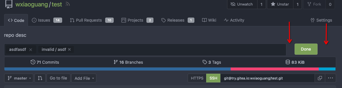
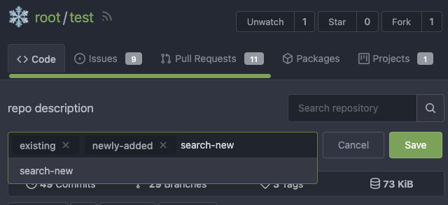
### Improve the Repo Topic Edit form

* Simplify the code
* Add a "Cancel" button
* Align elements

Before:

<details>

![image](https://user-images.githubusercontent.com/2114189/223325782-f09532de-0c38-4742-ba86-ed35cc9a858d.png)

</details>

After:

![image](https://user-images.githubusercontent.com/2114189/226796347-207feb0a-b3cd-4820-8a3e-01930bab1069.png)
2023-03-26 19:31:26 +08:00
Hester Gong a9cceb0597
Fix long project name display in issue list and in related dropdown (#23653)
This PR is to fix the second problem mentioned in #23625, along with the
long texts problem in `issue-item-bottom-row` of `issuelist.tmpl`

Main changes are:
1. Add `max-width` to the search dropdowns in issue list and make the
possible long texts inside to show ellipsis if texts are long
2. Adjust the conditions in
[issuelist.tmpl](1d35fa0e78/templates/shared/issuelist.tmpl (L146-L167))
to fix the problem as mentioned by the
[comment](https://github.com/go-gitea/gitea/issues/23625#issuecomment-1479281060)
3. Use `word-break: break-word;` in `issue-item-bottom-row` to break the
possible long texts.

After the PR
issuelist in repo (similar for pr list):
<img width="366" alt="截屏2023-03-23 17 42 40"
src="https://user-images.githubusercontent.com/17645053/227163953-93e9adbd-5785-4c16-b538-9db901787775.png">

dropdowns with long name (Here take reference from github to deal with
the long names cases: show ellipsis with no title, because all these
options are clickable, and it might not be necessary to add titles to
them ):

<img width="370" alt="截屏2023-03-23 17 43 50"
src="https://user-images.githubusercontent.com/17645053/227164215-df6fcaaa-9fee-4256-a57c-053fbcffafbb.png">

<img width="365" alt="截屏2023-03-23 17 43 56"
src="https://user-images.githubusercontent.com/17645053/227164227-9c99abcd-f410-4e07-b5b8-cbce764eedcd.png">

issue page (similar for pr page):
<img width="374" alt="截屏2023-03-23 17 45 37"
src="https://user-images.githubusercontent.com/17645053/227164668-654a8188-dac8-4bbf-a6e3-f3768a644a1b.png">

on PC:
<img width="1412" alt="截屏2023-03-23 17 47 20"
src="https://user-images.githubusercontent.com/17645053/227166694-e7bcc6e5-9667-4cef-9fbf-db85640a2c6c.png">

<img width="1433" alt="截屏2023-03-23 17 46 40"
src="https://user-images.githubusercontent.com/17645053/227165182-4e2a5d19-74bc-4c66-b73c-23cbca176ffe.png">
2023-03-24 15:11:23 +08:00
Hester Gong 9cefb7be73
Fix new issue/pull request btn margin when it is next to sort (#23647)
Close #23627 

Added margin left to the button when it is next to the svg, which has a
margin-right of `-0.5rem`

And here it might be better if `white-space: nowrap;` is added because
otherwise it might look like below on pull requests page on smaller
screen

<img width="945" alt="截屏2023-03-23 09 57 41"
src="https://user-images.githubusercontent.com/17645053/227079613-71c696ab-55ec-4641-acb9-622a8baebb31.png">

After:
<img width="936" alt="截屏2023-03-23 10 08 27"
src="https://user-images.githubusercontent.com/17645053/227080971-6bf2588e-40dd-4770-b0d1-45d7c63e0f48.png">

Pull Request on smaller screen
<img width="922" alt="截屏2023-03-23 10 25 16"
src="https://user-images.githubusercontent.com/17645053/227084144-0c2ed3e6-5c11-4252-bba2-b5f971b70f4a.png">
2023-03-23 14:07:04 -04:00
wxiaoguang 6bad0fb24f
Fix review comment context menu clipped bug (#23523)
This is another regression of #22959 (the first regression has been
fixed by the Image Diff fix)

Close #23517

This is a quick fix. Luckily, there is no "dropdown menu" for image/csv
view, so we could only add the "overflow-x: scroll" to the image/csv
view.

After fix:


![image](https://user-images.githubusercontent.com/2114189/225643575-9e964b4f-5543-4a69-86c2-2ffc8e40d9a6.png)


![image](https://user-images.githubusercontent.com/2114189/225643670-f0e575d0-f4af-41f4-b023-2d9ddb6462e9.png)

Co-authored-by: KN4CK3R <admin@oldschoolhack.me>
2023-03-16 14:25:04 -04:00
silverwind 202803fc69
Replace Less with CSS (#23481)
Ran most of the Less files through the Less compiler and Prettier and
then followed up with a round of manual fixes.

The Less compiler had unfortunately stripped all `//` style comments
that I had to restore (It did preserve `/* */` comments). Other fixes
include duplicate selector removal which were revealed after the
transpilation and which weren't caught by stylelint before but now are.

Fixes: https://github.com/go-gitea/gitea/issues/15565
2023-03-14 22:20:19 -04:00
Renamed from web_src/less/helpers.less (Browse further)