* Remove some deadcode
* Use 2-word name for CSS class names
* Remove "gt-*" rules for sanitizer

The UI doesn't change much.

(cherry picked from commit 66902d89e567ab1ae6dfb828636999c61ff0149e)
Previously, the citation js would load every time when opening a citable
repo. Now it only loads when the user clicks the button for it. The
loading state is representend with a spinner on the button:

<img width="83" alt="Screenshot 2024-03-17 at 00 25 13"
src="https://github.com/go-gitea/gitea/assets/115237/29649089-13f3-4974-ab81-e12c0f8e651f">

Diff ist best viewed with whitespace hidden.

---------

Co-authored-by: Giteabot <teabot@gitea.io>
(cherry picked from commit 4b1c88628a6856e533ff10d346ca5bd73ce952b3)
Remove this CSS-only module, which gives a nice reduction in CSS size.
Should look exactly like before.

(cherry picked from commit 4e547822f348c2963e0db33135b45d43dfc58df8)
The modal was broken in two ways:

- On small screens, the input box was partially hanging outside the
modal. Fixed with flexbox and increased modal width.
- The clipboard copy was not working because the modal had both
`data-clipboard-text` and `data-clipboard-target`, while we only support
one of those. Made a small tweak in clipboard as well so that it will
still fall back to target if text is empty.

(cherry picked from commit 94512ee0628dc0d2b697441a4355ace54b6515cd)
A previous commit (via gitea#29638) changed the `.repository .data-table
.tr` CSS rule to forcibly override the background to `none`. This, in
turn, disabled the even-odd row coloring.

Doing so should be a preference of the theme used, and should not be
enforced by the core CSS rules. This patch removes the override.

Signed-off-by: Gergely Nagy <forgejo@gergo.csillger.hu>
Tested a few things, all working fine. Not sure if the chinese machine
translation is good.

---------

Co-authored-by: wxiaoguang <wxiaoguang@gmail.com>
(cherry picked from commit 7e8c1c5ba18e1ac8861f429b825163b8210fd178)

Conflicts:
	docs/content/contributing/guidelines-frontend.zh-cn.md
	Gitea docs
Follow #29418

I think using "flex-wrap: wrap" here is better than hard-coding the screen width.

By using "flex-wrap: wrap", the UI layouts automatically for various
widths (even if in some languages, the sentence might be pretty long)

(cherry picked from commit ade62416917bc87810991585d7047851834ee316)
Replace 18 `gt-` prefixes with `tw-` with perl replacement. I manually
checked them all with `rg` afterwards.

(cherry picked from commit a2e90014ec20a1085449a66061389cfe0d12260f)

Conflicts:
	templates/repo/header.tmpl
	because some of the header moved to header_fork.tmpl
Improve contrast by lightening the text colors in dark theme by around
35%. Additionally, share some variables that had the same or similar
color, which will ease future theme creation.

(cherry picked from commit e94e2fb6c5484070d56977644213d735df9e0c10)
The elements were hidden on small screens to preserve space and the
icons still conveyed the meaning for users with intact eye vision.
However, the names were no longer exposed to screen readers, and their
users usually cannot obtain the meaning from the icons.

Adding aria-labels to the affected templates results in certain
complexity due to the DOM, so instead I decided to use some accessible
CSS tricks to move the content off the screen instead of hiding it. It
should remain accessible for most screen readers.
While it might be favourable to have distinct focus and hover styling,
having no focus styling at all makes keyboard navigation very difficult.

Some people consider :focus to be equal to a keyboard-driven :hover, so
I'm moving the focus pseudo-classes from being a no-op to adding the
hover styling.
- Trivial auto-fix applied.
- Removed CSS that was no longer needed (either was removed or upstream
already improved the CSS).
- Used existing variables for colors.
- Fix CSS selectors to match existing ones.
- Port 1fd7e3d6be to the Forgejo themes,
they are a copy paste, but have a bit darker console background color to
have better contrast and match better with the overal Forgejo dark
theme's shade.
There are a few inconsistencies within Gitea and this PR addresses one of them.
This PR updates the sign-in page layout, including the register and openID tabs,
to match the layout of the settings pages (`/user/settings`) for more consistency.

**Before**
<img width="968" alt="Screenshot 2024-02-05 at 8 27 24 AM"
src="https://github.com/go-gitea/gitea/assets/6152817/fb0cb517-57c0-4eed-be1d-56f36bd1960d">

**After**
<img width="968" alt="Screenshot 2024-02-05 at 8 26 39 AM"
src="https://github.com/go-gitea/gitea/assets/6152817/428d691d-0a42-4a67-a646-05527f2a7b41">

---------

Co-authored-by: rafh <rafaelheard@gmail.com>
(cherry picked from commit 1c14cd0c43d670fef984068e2666641ea5a062db)
- When previewing the content in a review, no font size was set. This
resulted in the previewed content being bigger than other text and
therefor creating an noticable inconsistency.
- Set the font size of the previewed content, 14px, this is consistent
with how the content would be rendered.
- `comment-code-cloud` is the class used for the review boxes.
`.ui.tab.markup` means it only applies to the preview tab.
- This is actually https://github.com/go-gitea/gitea/pull/19978 &
https://github.com/go-gitea/gitea/pull/19486 but was removed in one of
the UI refactors of v1.20
- This is a very technical fix and is best explained in the CSS
comments. But the short version: When there's an overflow being set, but
you want an element to 'break out' of that overflow with `position:
absolute`, it sometimes doesn't work! You need to set some CSS to let
the browser know that the element needs to use an element outside of
that overflow as 'clip parent'.
- Resolves my internal frustration with the mobile UI constantly getting broken.

(cherry picked from commit 879f842bed)
(cherry picked from commit 6099c9b41b)
(cherry picked from commit 0749d00b16)
(cherry picked from commit ec6a5428a7)
(cherry picked from commit 9d0bee784d)
(cherry picked from commit 61d6ae4882)
(cherry picked from commit 8b3f3639b6)
(cherry picked from commit 2c600ddb2c)
(cherry picked from commit 960a9786ef)
(cherry picked from commit b194354c3b)
(cherry picked from commit 8e7915ee8c)
(cherry picked from commit ba82b0c6fe)
(cherry picked from commit b2dfb233a8)
(cherry picked from commit ff3ec7f612)
(cherry picked from commit ef01240cc7)
(cherry picked from commit 7778b5bb10)
(cherry picked from commit 5f949b1b07)
(cherry picked from commit b387209690)
(cherry picked from commit 5d7e3a542e)
(cherry picked from commit ffef2231fb)
(cherry picked from commit c74cf73ab4)
(cherry picked from commit 4aa9e9fca4)
(cherry picked from commit 6b0dab3ba0)
(cherry picked from commit 374612f61b)
This PR adds colorblind theme variants of the forgejo themes. I duplicated the forjego light and dark themes and only changed the lines related to diff colors for added and removed rows/words.
I am not a designer, and I am also colorblind, so better suggestions of colors are most welcome. However, this is a good start as I can at least personally see the colors now. I got the colors for the dark theme from the GitHub diff colors, the light ones I couldn't get from GitHub as they use white as a plain background, which Forgejo's theme doesn't, so they were decided on after a bit of random testing.
Resolves#986
(cherry picked from commit dcdb4a372d)
(cherry picked from commit faab0c670e)
(cherry picked from commit b6d59493c7)
(cherry picked from commit 837da0c1f4)
(cherry picked from commit 71ad245e1d)
(cherry picked from commit 85a7032f1b)

Conflicts:
	web_src/css/themes/theme-forgejo-auto.less
	web_src/css/themes/theme-forgejo-dark.less
	web_src/css/themes/theme-forgejo-light.less
	web_src/less/_home.less
        see https://codeberg.org/forgejo/forgejo/pulls/552
(cherry picked from commit 0c2c131bb0)

[BRANDING] Add Forgejo light, dark, and auto themes: fix import

Closes: https://codeberg.org/forgejo/forgejo/issues/562
(cherry picked from commit 2b0dc1f80f)
(cherry picked from commit 494ad6a3b7)
(cherry picked from commit 6940fc22c4)
(cherry picked from commit bd6f00656c)
(cherry picked from commit ebb506a124)
(cherry picked from commit 43d72d3781)
(cherry picked from commit 1a87adca01)
(cherry picked from commit 0704c410b4)
(cherry picked from commit 9039b47c16)
(cherry picked from commit e32bb78924)
(cherry picked from commit 053ad84f91)
(cherry picked from commit a35f1b6da7)
(cherry picked from commit 8cb94c01d5)

[BRANDING] fix invisible label in branch protection settings

(cherry picked from commit 23e5d45721)
(cherry picked from commit f02e4582e5)

[BRANDING] Fix commit label for Forgejo Dark theme (#843)

- Define the `--color-label-text` variable with a light color, which is currently used for commit's SHA

Co-authored-by: Gusted <postmaster@gusted.xyz>
Reviewed-on: https://codeberg.org/forgejo/forgejo/pulls/843
(cherry picked from commit 74c186a380)
(cherry picked from commit 7e185c5ca5)

[BRANDING] Add Forgejo light, dark, and auto themes (squash) variables

Adapt to b6bcb79987 Improve notification
icon and navbar

Refs: https://codeberg.org/forgejo/forgejo/issues/893

[BRANDING] Add Forgejo light variables

Updates the Forgejo light theme with the changes in b6bcb7998

These are the same changes as made in 2574dbcff to the dark theme

Refs: forgejo/forgejo#893
(cherry picked from commit 9e99fe4f9e)
(cherry picked from commit acbb98bd91)
(cherry picked from commit c80245ed87)

[BRANDING] fix code highlight color in Forgejo themes

(cherry picked from commit ffc49a4e99)
(cherry picked from commit c5f45a941e)
(cherry picked from commit eee5427c9d)
(cherry picked from commit 89be50ca27)
(cherry picked from commit 74e4776ef5)
(cherry picked from commit 6c4e07a6a7)

[BRANDING] more accessible text selection color in Forgejo themes

(cherry picked from commit 7407605ffdedef8fa320477a3bd7efa06df263e2)
(cherry picked from commit 5aab3872cc)
(cherry picked from commit 1ec77d8bd0)
(cherry picked from commit 964c89fce7)
(cherry picked from commit 8a8023a441)
(cherry picked from commit 1c9ffeadf5)

[BRANDING] Fix navigation hover color (squash)

- For items in the navigation bar, use different background colours for hover.
- Regression since https://github.com/go-gitea/gitea/pull/25343

(cherry picked from commit 8f3f4b219c)
(cherry picked from commit edfb0eef06)
(cherry picked from commit a6367fa48a)
(cherry picked from commit d5697abe42)
(cherry picked from commit eaf5370919)
(cherry picked from commit 58f11e7310)
(cherry picked from commit 732e1b35d5)
(cherry picked from commit 0d794ae1c9)
(cherry picked from commit ccc8aed308)

Conflicts:
	modules/setting/ui.go
	https://codeberg.org/forgejo/forgejo/pulls/1582
(cherry picked from commit 209059fbaf)
(cherry picked from commit 80ba2df4a7)
(cherry picked from commit 17b325da23)
(cherry picked from commit 3518b87c8d)
(cherry picked from commit 4042143f96)
(cherry picked from commit 07f976f9d7)
(cherry picked from commit 1bbc6b93e9)
(cherry picked from commit 8aa0bba307)
(cherry picked from commit 94c4a14ac3)

Update Forgejo theme (squash)

- Incorporate changes from 79a4c80f8d into the Forgejo themes.
- Fix that there's no focus or active coloring on primary and secondary
buttons for Forgejo themes caused by
023e937141 that moved variablse from
base.css (shared) to the themes.
- Extend hack to make red buttons darker on dark Forgejo theme to
include active styling and remove the unnecessary `!important`.

(cherry picked from commit 2e32da4419)
(cherry picked from commit a4eca09543)
(cherry picked from commit e6e452811d)
(cherry picked from commit e9a5addf3d)
(cherry picked from commit a1b8b5fa0d)

[BRANDING] Update forgejo theme

- Inlcude a103b79f60 and
1b2cd4c4e1 and
376c0e25f7 and 023e937141
into the Forgejo theme.
- Fix tooltips not being visual, due to missing background color.
- Fix labels not having a background color.
- Fix modals not having a dimmed background.
- Fix no syntax highlighting on Forgejo light due to missing imports.
- Incorporate feedback from
https://codeberg.org/forgejo/forgejo/issues/1117 to make the labels
stand out less.

(cherry picked from commit bc21dc21e1)
(cherry picked from commit 82323c09cc)
(cherry picked from commit 2da09af28d)
(cherry picked from commit 978aeb7cde)
(cherry picked from commit 984c264e19)
(cherry picked from commit 6aa7c8db38)
(cherry picked from commit 4379269a46)

Conflicts:
	modules/setting/ui.go
	https://codeberg.org/forgejo/forgejo/pulls/2116
(cherry picked from commit 9414391ec1)
(cherry picked from commit 02c9b776e8)
(cherry picked from commit 7324b417ce)
(cherry picked from commit b20aa3ed17)
- Add the ability to block a user via their profile page.
- This will unstar their repositories and visa versa.
- Blocked users cannot create issues or pull requests on your the doer's repositories (mind that this is not the case for organizations).
- Blocked users cannot comment on the doer's opened issues or pull requests.
- Blocked users cannot add reactions to doer's comments.
- Blocked users cannot cause a notification trough mentioning the doer.
Reviewed-on: https://codeberg.org/forgejo/forgejo/pulls/540
(cherry picked from commit 687d852480)
(cherry picked from commit 0c32a4fde5)
(cherry picked from commit 1791130e3c)
(cherry picked from commit 37858b7e8f)
(cherry picked from commit a3e2bfd7e9)
(cherry picked from commit 7009b9fe87)
Conflicts: https://codeberg.org/forgejo/forgejo/pulls/1014
routers/web/user/profile.go
templates/user/profile.tmpl
(cherry picked from commit b2aec34791)
(cherry picked from commit e2f1b73752)
[MODERATION] organization blocking a user (#802)
- Resolves#476
- Follow up for: #540
- Ensure that the doer and blocked person cannot follow each other.
- Ensure that the block person cannot watch doer's repositories.
- Add unblock button to the blocked user list.
- Add blocked since information to the blocked user list.
- Add extra testing to moderation code.
- Blocked user will unwatch doer's owned repository upon blocking.
- Add flash messages to let the user know the block/unblock action was successful.
- Add "You haven't blocked any users" message.
- Add organization blocking a user.
Co-authored-by: Gusted <postmaster@gusted.xyz>
Reviewed-on: https://codeberg.org/forgejo/forgejo/pulls/802
(cherry picked from commit 0505a10421)
(cherry picked from commit 37b4e6ef9b)
(cherry picked from commit c17c121f2c)
[MODERATION] organization blocking a user (#802) (squash)
Changes to adapt to:
6bbccdd177 Improve AJAX link and modal confirm dialog (#25210)
Refs: https://codeberg.org/forgejo/forgejo/pulls/882/files#issuecomment-945962
Refs: https://codeberg.org/forgejo/forgejo/pulls/882#issue-330561
(cherry picked from commit 523635f83c)
(cherry picked from commit 4743eaa6a0)
(cherry picked from commit eff5b43d2e)
Conflicts: https://codeberg.org/forgejo/forgejo/pulls/1014
routers/web/user/profile.go
(cherry picked from commit 9d359be5ed)
(cherry picked from commit b1f3069a22)
[MODERATION] add user blocking API
- Follow up for: #540, #802
- Add API routes for user blocking from user and organization
perspective.
- The new routes have integration testing.
- The new model functions have unit tests.
- Actually quite boring to write and to read this pull request.
(cherry picked from commit f3afaf15c7)
(cherry picked from commit 6d754db3e5)
(cherry picked from commit 2a89ddc0ac)
(cherry picked from commit 4a147bff7e)
Conflicts:
routers/api/v1/api.go
templates/swagger/v1_json.tmpl
(cherry picked from commit bb8c339185)
(cherry picked from commit 5a11569a01)
(cherry picked from commit 2373c801ee)
[MODERATION] restore redirect on unblock
ctx.RedirectToFirst(ctx.FormString("redirect_to"), ctx.ContextUser.HomeLink())
was replaced by
ctx.JSONOK()
in 128d77a3a Following up fixes for "Fix inconsistent user profile layout across tabs" (#25739)
thus changing the behavior (nicely spotted by the tests). This
restores it.
(cherry picked from commit 597c243707)
(cherry picked from commit cfa539e590)
[MODERATION] Add test case (squash)
- Add an test case, to test an property of the function.
(cherry picked from commit 70dadb1916)
[MODERATION] Block adding collaborators
- Ensure that the doer and blocked user cannot add each other as
collaborators to repositories.
- The Web UI gets an detailed message of the specific situation, the API
gets an generic Forbidden code.
- Unit tests has been added.
- Integration testing for Web and API has been added.
- This commit doesn't introduce removing each other as collaborators on
the block action, due to the complexity of database calls that needs to
be figured out. That deserves its own commit and test code.
(cherry picked from commit 747be949a1)
[MODERATION] move locale_en-US.ini strings to avoid conflicts
Conflicts:
web_src/css/org.css
web_src/css/user.css
https://codeberg.org/forgejo/forgejo/pulls/1180
(cherry picked from commit e53f955c88)
Conflicts:
services/issue/comments.go
https://codeberg.org/forgejo/forgejo/pulls/1212
(cherry picked from commit b4a454b576)
Conflicts:
models/forgejo_migrations/migrate.go
options/locale/locale_en-US.ini
services/pull/pull.go
https://codeberg.org/forgejo/forgejo/pulls/1264
[MODERATION] Remove blocked user collaborations with doer
- When the doer blocks an user, who is also an collaborator on an
repository that the doer owns, remove that collaboration.
- Added unit tests.
- Refactor the unit test to be more organized.
(cherry picked from commit ec87016178)
(cherry picked from commit 313e6174d8)
[MODERATION] QoL improvements (squash)
- Ensure that organisations cannot be blocked. It currently has no
effect, as all blocked operations cannot be executed from an
organisation standpoint.
- Refactored the API route to make use of the `UserAssignmentAPI`
middleware.
- Make more use of `t.Run` so that the test code is more clear about
which block of code belongs to which test case.
- Added more integration testing (to ensure the organisations cannot be
blocked and some authorization/permission checks).
(cherry picked from commit e9d638d075)
[MODERATION] s/{{avatar/{{ctx.AvatarUtils.Avatar/
(cherry picked from commit ce8b30be13)
(cherry picked from commit f911dc4025)
Conflicts:
options/locale/locale_en-US.ini
https://codeberg.org/forgejo/forgejo/pulls/1354
(cherry picked from commit c1b37b7fda)
(cherry picked from commit 856a2e0903)
[MODERATION] Show graceful error on comment creation
- When someone is blocked by the repository owner or issue poster and
try to comment on that issue, they get shown a graceful error.
- Adds integration test.
(cherry picked from commit 490646302e)
(cherry picked from commit d3d88667cb)
(cherry picked from commit 6818de13a9)
[MODERATION] Show graceful error on comment creation (squash) typo
(cherry picked from commit 1588d4834a)
(cherry picked from commit d510ea52d0)
(cherry picked from commit 8249e93a14)
[MODERATION] Refactor integration testing (squash)
- Motivation for this PR is that I'd noticed that a lot of repeated
calls are happening between the test functions and that certain tests
weren't using helper functions like `GetCSRF`, therefor this refactor of
the integration tests to keep it: clean, small and hopefully more
maintainable and understandable.
- There are now three integration tests: `TestBlockUser`,
`TestBlockUserFromOrganization` and `TestBlockActions` (and has been
moved in that order in the source code).
- `TestBlockUser` is for doing blocking related actions as an user and
`TestBlockUserFromOrganization` as an organisation, even though they
execute the same kind of tests they do not share any database calls or
logic and therefor it currently doesn't make sense to merge them
together (hopefully such oppurtinutiy might be presented in the future).
- `TestBlockActions` now contain all tests for actions that should be
blocked after blocking has happened, most tests now share the same doer
and blocked users and a extra fixture has been added to make this
possible for the comment test.
- Less code, more comments and more re-use between tests.
(cherry picked from commit ffb393213d)
(cherry picked from commit 85505e0f81)
(cherry picked from commit 0f3cf17761)
[MODERATION] Fix network error (squash)
- Fix network error toast messages on user actions such as follow and
unfollow. This happened because the javascript code now expects an JSON
to be returned, but this wasn't the case due to
cfa539e590127b4953b010fba3dea21c82a1714.
- The integration testing has been adjusted to instead test for the
returned flash cookie.
(cherry picked from commit 112bc25e54)
(cherry picked from commit 1194fe4899)
(cherry picked from commit 9abb95a844)
[MODERATION] Modernize frontend (squash)
- Unify blocked users list.
- Use the new flex list classes for blocked users list to avoid using
the CSS helper classes and thereby be consistent in the design.
- Fix the modal by using the new modal class.
- Remove the icon in the modal as looks too big in the new design.
- Fix avatar not displaying as it was passing the context where the user
should've been passed.
- Don't use italics for 'Blocked since' text.
- Use namelink template to display the user's name and homelink.
(cherry picked from commit ec935a16a3)
(cherry picked from commit 67f37c8346)
Conflicts:
models/user/follow.go
models/user/user_test.go
routers/api/v1/user/follower.go
routers/web/shared/user/header.go
routers/web/user/profile.go
templates/swagger/v1_json.tmpl
https://codeberg.org/forgejo/forgejo/pulls/1468
(cherry picked from commit 6a9626839c)
Conflicts:
tests/integration/api_nodeinfo_test.go
https://codeberg.org/forgejo/forgejo/pulls/1508#issuecomment-1242385
(cherry picked from commit 7378b251b4)
Conflicts:
models/fixtures/watch.yml
models/issues/reaction.go
models/issues/reaction_test.go
routers/api/v1/repo/issue_reaction.go
routers/web/repo/issue.go
services/issue/issue.go
https://codeberg.org/forgejo/forgejo/pulls/1547
(cherry picked from commit c2028930c1)
(cherry picked from commit d3f9134aee)
(cherry picked from commit 7afe154c5c)
(cherry picked from commit 99ac7353eb)
(cherry picked from commit a9cde00c5c)
Conflicts:
services/user/delete.go
https://codeberg.org/forgejo/forgejo/pulls/1736
(cherry picked from commit 008c0cc63d)
[DEADCODE] add exceptions
(cherry picked from commit 12ddd2b10e)
[MODERATION] Remove deadcode (squash)
- Remove deadcode that's no longer used by Forgejo.
(cherry picked from commit 0faeab4fa9)
[MODERATION] Add repo transfers to blocked functionality (squash)
- When someone gets blocked, remove all pending repository transfers
from the blocked user to the doer.
- Do not allow to start transferring repositories to the doer as blocked user.
- Added unit testing.
- Added integration testing.
(cherry picked from commit 8a3caac330)
(cherry picked from commit a92b4cfeb6)
(cherry picked from commit acaaaf07d9)
(cherry picked from commit 735818863c)
(cherry picked from commit f50fa43b32)
(cherry picked from commit e166836433)
(cherry picked from commit 82a0e4a381)
(cherry picked from commit ff233c19c4)
(cherry picked from commit 8ad87d215f)
[MODERATION] Fix unblock action (squash)
- Pass the whole context instead of only giving pieces.
- This fixes CSRF not correctly being inserted into the unblock buttons.
(cherry picked from commit 2aa51922ba)
(cherry picked from commit 7ee8db0f01)
(cherry picked from commit e4f8b999bc)
(cherry picked from commit 05aea60b13)
(cherry picked from commit dc0d61b012)
(cherry picked from commit f53fa583de)
(cherry picked from commit c65b89a58d)
(cherry picked from commit 69e50b9969)
(cherry picked from commit ec127440b8)
[MODERATION] cope with shared fixtures
* There is one more issue in the fixtures and this breaks some tests
* The users in the shared fixtures were renamed for clarity and that
breaks some tests
(cherry picked from commit 707a4edbdf)
Conflicts:
modules/indexer/issues/indexer_test.go
https://codeberg.org/forgejo/forgejo/pulls/1508
(cherry picked from commit 82cc044366)
(cherry picked from commit 2776aec7e8)
(cherry picked from commit 1fbde36dc7)
(cherry picked from commit 1293db3c4e)
(cherry picked from commit 6476802175)
(cherry picked from commit 5740f2fc83)
(cherry picked from commit afc12d7b6e)
[MODERATION] Fix transfer confirmation (squash)
- Fix problem caused by the clearer confirmation for dangerous actions commit.
(cherry picked from commit 3488f4a9cb)
(cherry picked from commit ed7de91f6a)
(cherry picked from commit 2d97929b9b)
(cherry picked from commit 50d035a7b0)
(cherry picked from commit 0a0c07d78a)
(cherry picked from commit 85e55c4dbc)
(cherry picked from commit d8282122ad)
(cherry picked from commit 3f0b3b6cc5)
[MODERATION] Purge issues on user deletion (squash)
(cherry picked from commit 4f529d9596)
(cherry picked from commit f0e3acadd3)
(cherry picked from commit 682c4effe6)
(cherry picked from commit e43c2d84fd)
(cherry picked from commit 9c8e53ccc7)
(cherry picked from commit a9eb7ac783)
[MODERATION] Purge issues on user deletion (squash) revert shared fixtures workarounds
(cherry picked from commit 7224653a40)
(cherry picked from commit aa6e8672f9)
(cherry picked from commit 58c7947e95)
(cherry picked from commit f1aacb1851)
(cherry picked from commit 0bf174af87)
(cherry picked from commit f9706f4335)
[MODERATION] Prepare moderation for context locale changes (squash)
- Resolves https://codeberg.org/forgejo/forgejo/issues/1711
(cherry picked from commit 2e289baea9)
(cherry picked from commit 97b16bc19a)
[MODERATION] User blocking (squash) do not use shared fixture
It conflicts with a fixtured added in the commit
Fix comment permissions (#28213) (#28216)
(cherry picked from commit ab40799dcab24e9f495d765268b791931da81684)
(cherry picked from commit 996c92cafd)
(cherry picked from commit 259912e3a6)
Conflicts:
options/locale/locale_en-US.ini
https://codeberg.org/forgejo/forgejo/pulls/1921
(cherry picked from commit 1e82abc032)
(cherry picked from commit a176fee160)
(cherry picked from commit 0480b76dfe)
(cherry picked from commit 4bc06b7b38)
(cherry picked from commit 073094cf72)
(cherry picked from commit ac6201c647)
(cherry picked from commit 7e0812674d)
(cherry picked from commit 068c741e56)
Conflicts:
models/repo_transfer.go
models/repo_transfer_test.go
routers/web/user/profile.go
https://codeberg.org/forgejo/forgejo/pulls/2298
In the commit 5a56f9699c (3.) the min-height was applied to all wiki
elements. This resulted in huge blank spaces when viewing the wiki.

This fixes this by only applying the min-height to the preview when
editing.

Refs: https://codeberg.org/forgejo/forgejo/pulls/2080

(cherry picked from commit 8f0baefe5d)

Co-authored-by: Fl1tzi <git@fl1tzi.com>
This patch adds a hover background for the wiki row in wiki list page,
which make its behavior more close to repo's file list page.
This patch also make the wiki-git-entry visible on the row is hovered
instead of the cel, so users won't be confused since the 'grid' is not
visible from the web page.
After the patch: (when the wiki named 'Home' is hovered)

Part of https://github.com/go-gitea/gitea/issues/27097:

- `gitea` theme is renamed to `gitea-light`
- `arc-green` theme is renamed to `gitea-dark`
- `auto` theme is renamed to `gitea-auto`

I put both themes in separate CSS files, removing all colors from the
base CSS. Existing users will be migrated to the new theme names. The
dark theme recolor will follow in a separate PR.

## ⚠️ BREAKING ⚠️

1. If there are existing custom themes with the names `gitea-light` or
`gitea-dark`, rename them before this upgrade and update the `theme`
column in the `user` table for each affected user.
2. The theme in `<html>` has moved from `class="theme-name"` to
`data-theme="name"`, existing customizations that depend on should be
updated.

---------

Co-authored-by: Lunny Xiao <xiaolunwen@gmail.com>
Co-authored-by: Giteabot <teabot@gitea.io>
Currently, checkboxes are positioned as absolute. This positioning
causes the input to overlay an element that has been floated within the
editor. Floated elements are useful if you want your text to wrap around
this element. This PR fixes the overlaying of checkboxes by removing the
absolute positioning, updating the `ul` padding, and
displaying`.task-list-item` `flex` to ensure inputs and the associated
label are on the same line.

Screenshots:

Before:
<img width="762" alt="Screenshot 2023-09-01 at 3 40 59 PM"
src="https://github.com/go-gitea/gitea/assets/6152817/570247c7-7f5c-4697-bfc9-ad4655e37991">

After:
<img width="762" alt="Screenshot 2023-09-01 at 3 42 20 PM"
src="https://github.com/go-gitea/gitea/assets/6152817/db53df45-1294-4eee-84c0-b21ac4fdf805">

---------

Co-authored-by: rafh <rafaelheard@gmail.com>
The `.new-menu` was using a pseudo-element based fade-out effect.
Replace this with a more modern mask-based effect which in this case
required a child element to avoid fading out the background as well, so
I applied it to child `new-menu-inner` which was present on all these
menus except explore where I added it.

There is no visual difference except that the items on the explore page
have no `gap` between them any longer, making it consistent with other
menus. Before and after:

<img width="221" alt="Screenshot 2023-09-21 at 21 13 19"
src="https://github.com/go-gitea/gitea/assets/115237/b4a38ce2-cee1-4c54-84a5-e1d0bfd79e29">
<img width="222" alt="Screenshot 2023-09-21 at 21 32 36"
src="https://github.com/go-gitea/gitea/assets/115237/bb6b1335-d935-4ad4-bb85-3b0fc3027c2b">

Also, this cleans up the related CSS vars:

- `--color-header-wrapper-transparent` is removed, no longer needed
- `--color-header-wrapper` is defined in base theme as well, was
previously unset and therefor transparent.

[no whitespace
diff](https://github.com/go-gitea/gitea/pull/27181/files?diff=unified&w=1)
[demo of mask fade](https://jsfiddle.net/silverwind/tsfadb3u/)
- switch from some weird status badge to label
- translate untranslated `Reset registration token` string
- change documentation link from act_runner README to Gitea Docs site
- fix "No runners available" message width
- use `ctx.Locale.Tr` where possible

Before:

* The layout is quite complex
* The UI flickers when switch the stats (https://try.gitea.io/)

After:

* Simplify the code
* The UI doesn't flicker
Align everything with a new layout.

* Use "baseline" for some special elements, the "flex-item-icon" is for
the issue list only at the moment and I think it should be general
enough now (but not using "flex-item-leading" anymore in this case).
* Make the labels stretch themselves.
1. There is already `gt-ac`, so no need to introduce `flex-item-center`
2. The `flex-item-baseline` and `.flex-item-icon svg { margin-top: 1px
}` seem to be a tricky patch, they don't resolve the root problem, and
still cause misalignment in some cases.
* The root problem is: the "icon" needs to align with the sibling
"title"
* So, make the "icon" and the "title" both have the same height
3. `flex-text-inline` could only be used if the element is really
"inline", otherwise its `vertical-align` would make the box size change.
In most cases, `flex-text-block` is good enough.

---------
Co-authored-by: silverwind <me@silverwind.io>
Co-authored-by: Giteabot <teabot@gitea.io>
1. In many cases, the `flex-list` has previous and next `gt-hidden`
siblings, so relax the CSS selector to remove all ".segument .flex-list"
paddings.
2. Make the "Add key" button can toggle
3. Move help message into the related segment(panel). Otherwise users
would misread the message, eg: the SSH help seemed for GPG because they
are so near
4. Move modal element into the segment element, otherwise it affects the
layout
The changes for "commit-body" in #26877 are not ideal.

The reason is: the "commit-body" is usually a `<pre>`, it has default
margins. In most cases, we do not need that large margin. So, this PR
introduces a general but small margin for all "commit-body" elements.
Then these `gt-m-0` could be removed.

The `:not` selector is not needed, because the `.timeline-item` selector
is already clear enough.
1. Use `gt-invisible` instead of `invisible`.
2. Use `gt-word-break` instead of `dont-break-out` (there is a slight
different "hyphens", but I think it won't affect too much since it is
only used for the "full name").
3. Remove `.small.button:has(svg)` , now our buttons could layout SVG
correctly, and actually I didn't see this CSS class is used in code.
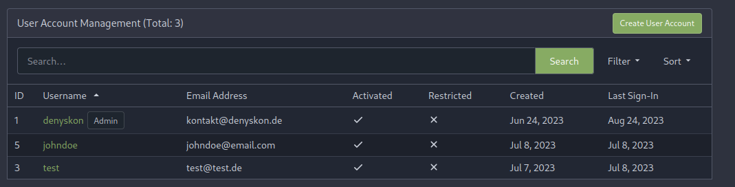
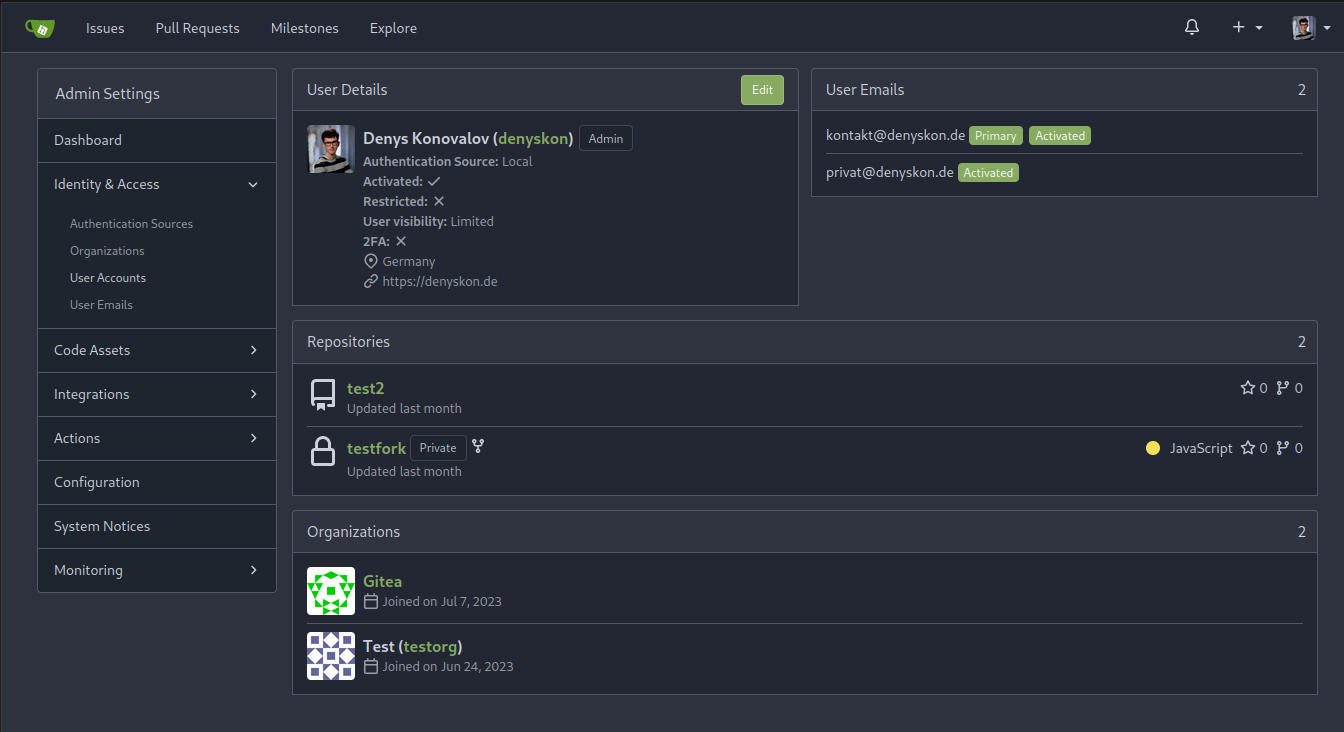
This PR implements a proposal to clean up the admin users table by
moving some information out to a separate user details page (which also
displays some additional information).
Other changes:
- move edit user page from `/admin/users/{id}` to
`/admin/users/{id}/edit` -> `/admin/users/{id}` now shows the user
details page
- show if user is instance administrator as a label instead of a
separate column
- separate explore users template into a page- and a shared one, to make
it possible to use it on the user details page
- fix issue where there was no margin between alert message and
following content on admin pages
<details>
<summary>Screenshots</summary>
</details>
Partially resolves#25939
---------
Co-authored-by: Giteabot <teabot@gitea.io>
Backtick syntax now works in repo description too. Also, I replaced the
CSS for this was a new single class, making it more flexible and not
dependent on a parent. Also, very slightly reduced font size from 16.8px
to 16px.

---------

Co-authored-by: wxiaoguang <wxiaoguang@gmail.com>
Each change is tested manually line by line. There are too many changes
so I can't share dozens of screenshots.

In short:

1. `ui right` could be still used in `ui top attached header`, because
there is a special case.
2. A lot of `ui right` are just no-op, so they can be removed safely.
3. Some of the `ui right` should be replaced by `gt-float-right` (to
avoid breaking, leave them to the future).
4. A few of the `ui right` could be rewritten by flex.
Corollary to #26775:
All selectors I found that are actually used and not necessarily present
in the current code have been copied to `web_src/css/base.css`.
Everything else should be a clean removal.
Replace #26761
It's better to keep children elements simple, and let parent containers
layout the necessary padding/margin.
The old `not(:last-child)` and `.flex-item + .flex-item` are not easy to
maintain (for example, what if the developer would like to use a "tiny
height" item?)
The old approach also makes some UI look strange because the first item
doesn't have proper padding-top.
In this PR, we just simply use `.flex-item { padding: ... }`:
* Developers could manually set the item height they want easily
* It's easier to make it work with various containers -- with padding
(`ui segment`) and without padding (`div`)
And added more samples/examples.
Co-authored-by: Giteabot <teabot@gitea.io>
1. Fine tune the CSS styles, and add more examples
2. Add necessary "dimmer" animation for modal dialogs, otherwise the UI
seems flicking (follow #26469)
## Changes
- no more hardcoded `border-radius`es (apart from `0`)
- no more value inconsistencies
- no more guessing what pixel value you should use
- two new variables:
- `--border-radius-medium` (for elements where the normal border radius
does not suffice)
  - `--border-radius-circle` (for displaying circles)

---------

Co-authored-by: silverwind <me@silverwind.io>
The "btn-octicon is-loading" was introduced by #21842 , it is only used
by the "Copy Content" button, but the "btn-octicon" selector would
affect too many uncertain elements.

Now there is a general "small-loading-icon" class, so the "btn-octicon
is-loading" could be removed.
1. Use `is-loading` instead of `ui loader`
2. Introduce class name `image-diff-tabs`, instead of searching `gt-hidden`, which is fragile
3. Align the UI elements, see the screenshots.
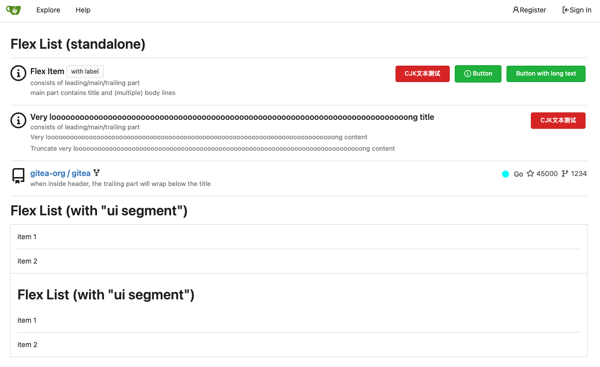
Fix#26617
1. Separate the "flex-list" examples into a dedicated template, and add some more examples
2. Use `flex-basis` instead of `flex-shrink` for `flex-item-trailing`, to avoid wrapping the texts too aggressively
3. Some `flex-wrap: wrap;` are removed
Removes all dropdown and dimmer animations. Works everywhere as far as I
can tell, but need to give this thorough testing. Removes around 70kb
JS/CSS.

Note, I'm not 100% sure regarding the various callbacks, those will need
more investigation, but it appears to work nonetheless.

Fixes: https://github.com/go-gitea/gitea/issues/15709
This PR refactors a bunch of projects-related code, mostly the
templates.
The following things were done:
- rename boards to columns in frontend code
- use the new `ctx.Locale.Tr` method
- cleanup template, remove useless newlines, classes, comments
- merge org-/user and repo level project template together
- move "new column" button into project toolbar
- move issue card (shared by projects and pinned issues) to shared
template, remove useless duplicated styles
- add search function to projects (to make the layout more similar to
milestones list where it is inherited from 😆)
- maybe more changes I forgot I've done 😆Closes#24893
After:


---------
Co-authored-by: silverwind <me@silverwind.io>
Not too important, but I think that it'd be a pretty neat touch.

Also fixes some layout bugs introduced by a previous PR.

---------

Co-authored-by: Gusted <postmaster@gusted.xyz>
Co-authored-by: Caesar Schinas <caesar@caesarschinas.com>
Co-authored-by: wxiaoguang <wxiaoguang@gmail.com>
This PR includes #26007 's changes but have a UI to prompt administrator
about the deprecated settings as well as the log or console warning.
Then users will have enough time to notice the problem and don't have
surprise like before.

<img width="1293" alt="图片"
src="https://github.com/go-gitea/gitea/assets/81045/c33355f0-1ea7-4fb3-ad43-cd23cd15391d">

---------

Co-authored-by: wxiaoguang <wxiaoguang@gmail.com>
- Tell the renderer to use the `document` mode, so it's consistent with
other renderers.
- Use the same padding as `.file-view.markup`, so it's consistent with
other containers that contain markup rendering.
- Resolves https://codeberg.org/forgejo/forgejo/issues/833

Co-authored-by: Gusted <postmaster@gusted.xyz>
This commit removes the hard-coded height of 500px, using that as a
max-height instead. The height of items in the dropdown menu, assuming a
default font size of 16px, is 36px, so the old CSS would cause overly
large dropdown menus in instances where less than 14 languages are
offered.

Refs: https://codeberg.org/forgejo/forgejo/pulls/1000

Co-authored-by: rome-user <rome-user@noreply.codeberg.org>
Co-authored-by: Giteabot <teabot@gitea.io>
Use a real button and add an aria-label.
Additionally, show the button whenever it is focused.
See https://codeberg.org/forgejo/forgejo/issues/998 for explanation.

Our handling of this button is now equal to that of GitHub.
Nothing has changed visually.
Issue filters are being used on repo list page and on milestone issues
page, and the code is mostly duplicated.

This PR does the following changes:
- move issue filters into a shared template
- allow filtering milestone issues by project, so no need to hide this
filter on milestone issues page
- remove some dead code (e. g. issue actions in milestone issues
template)
- fix label filter dropdown width

---------

Co-authored-by: 6543 <6543@obermui.de>
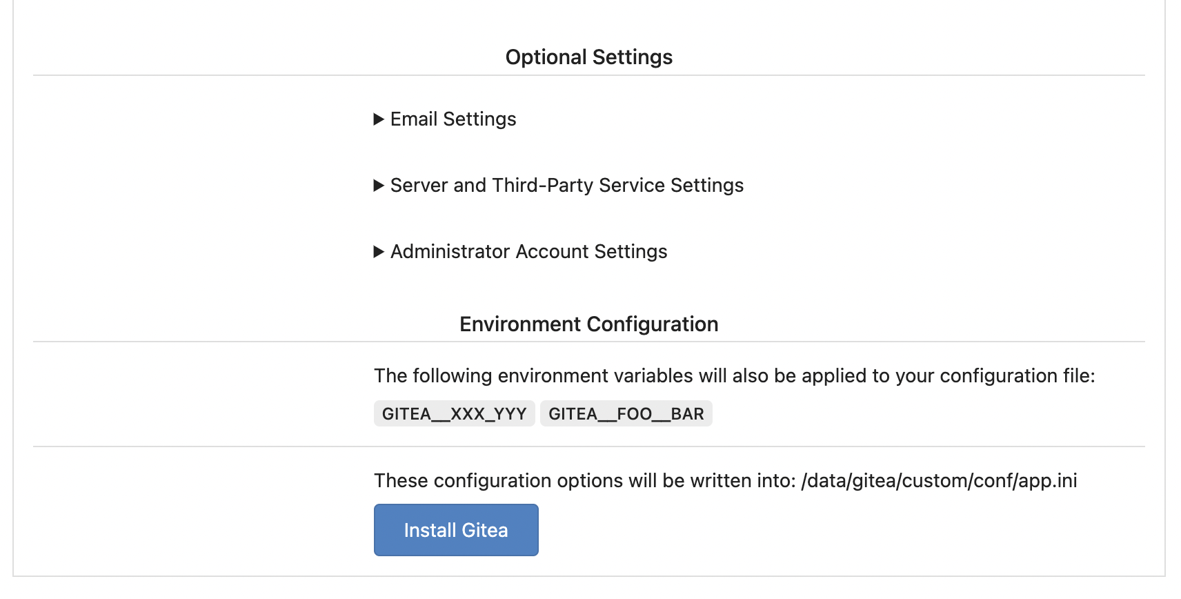
Replace #25580Fix#19453
The problem was: when users set "GITEA__XXX__YYY" , the "install page"
doesn't respect it.
So, to make the result consistent and avoid surprising end users, now
the "install page" also writes the environment variables to the config
file.
And, to make things clear, there are enough messages on the UI to tell
users what will happen.
There are some necessary/related changes to `environment-to-ini.go`:
* The "--clear" flag is removed and it was incorrectly written there.
The "clear" operation should be done if INSTALL_LOCK=true
* The "--prefix" flag is removed because it's never used, never
documented and it only causes inconsistent behavior.
This will prevent the most common cases of SVG shrinking because lack of
space. I evaluated multiple options and this seems to be the one with
the least impact in size and processing cost, so I went with it.

Unfortunately, CSS can not dynamically convert `16` obtained from
`attr()` to `16px`, or else a generic solution for all sizes would have
been possible. But a solution is [in
sight](https://developer.mozilla.org/en-US/docs/Web/CSS/attr#type-or-unit)
with `attr(width px)` but no browser supports it currently.
- Update all JS dependencies
- Enable `declaration-property-unit-disallowed-list` to forbid `em` on
`line-height`
- Rename dependency update targets to `update-js` and `update-py` and
document them
- Remove margin on Asciicast viewer
- Tested Swagger, Katex, Asciicast

<img width="1243" alt="Screenshot 2023-06-27 at 19 51 05"
src="https://github.com/go-gitea/gitea/assets/115237/2d2722a0-2aa7-4f4c-b8bd-17e1f3637b78">
Close#20976Close#20975
1. Fix the bug: the TOC in footer was incorrectly rendered as main
content's TOC
2. Fix the layout: on mobile, the TOC is put above the main content,
while the sidebar is put below the main content
3. Auto collapse the TOC on mobile
ps: many styles of "wiki.css" are moved from old css files, so leave
nits to following PRs.